
ABOUT PROJECT
Millies Collection
Millies’ product page needed stronger visual consistency. Capi Product refined typography, image placement, newsletter visibility, and UI colors to enhance usability.


THE TASK
01
The problem
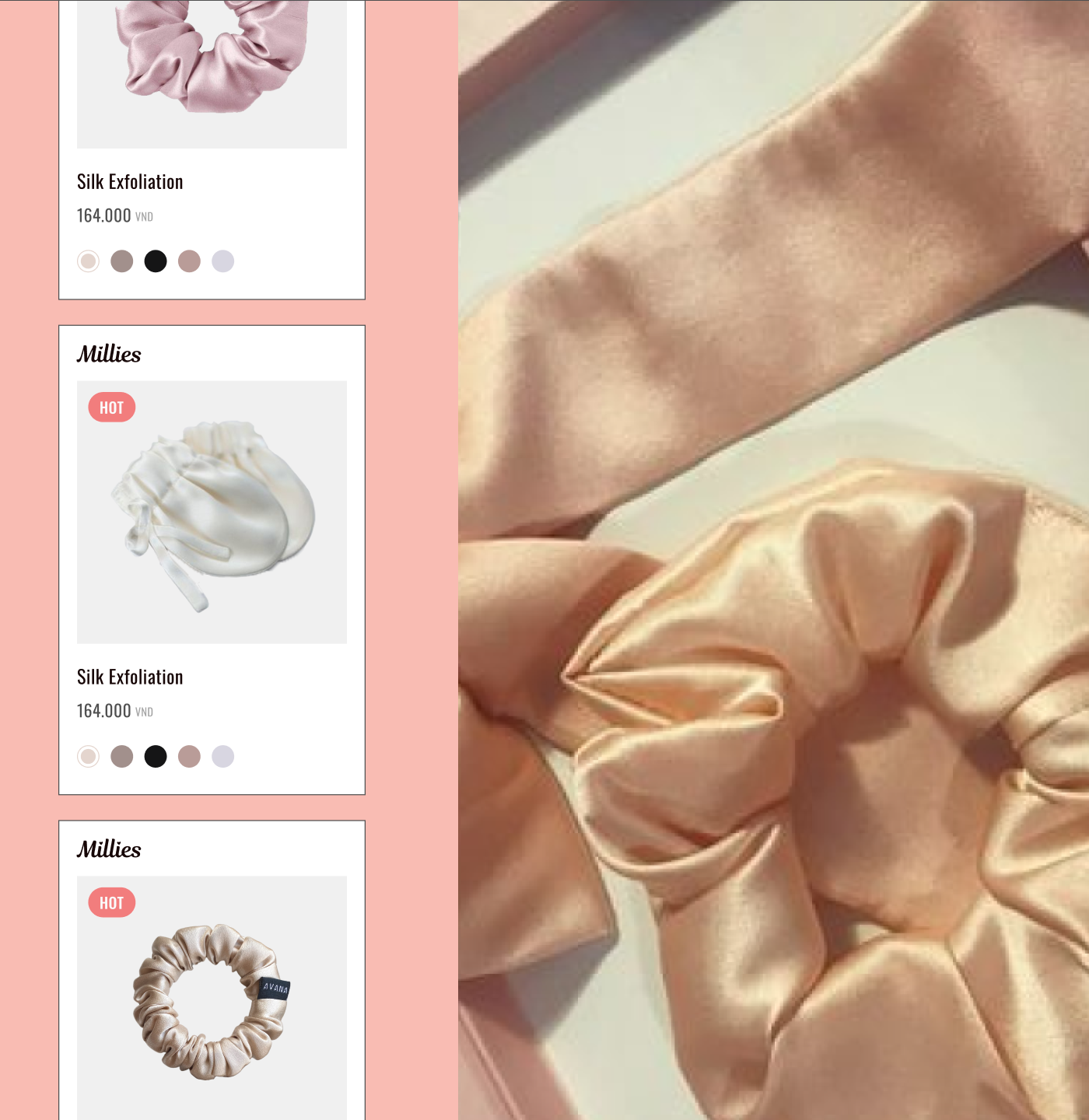
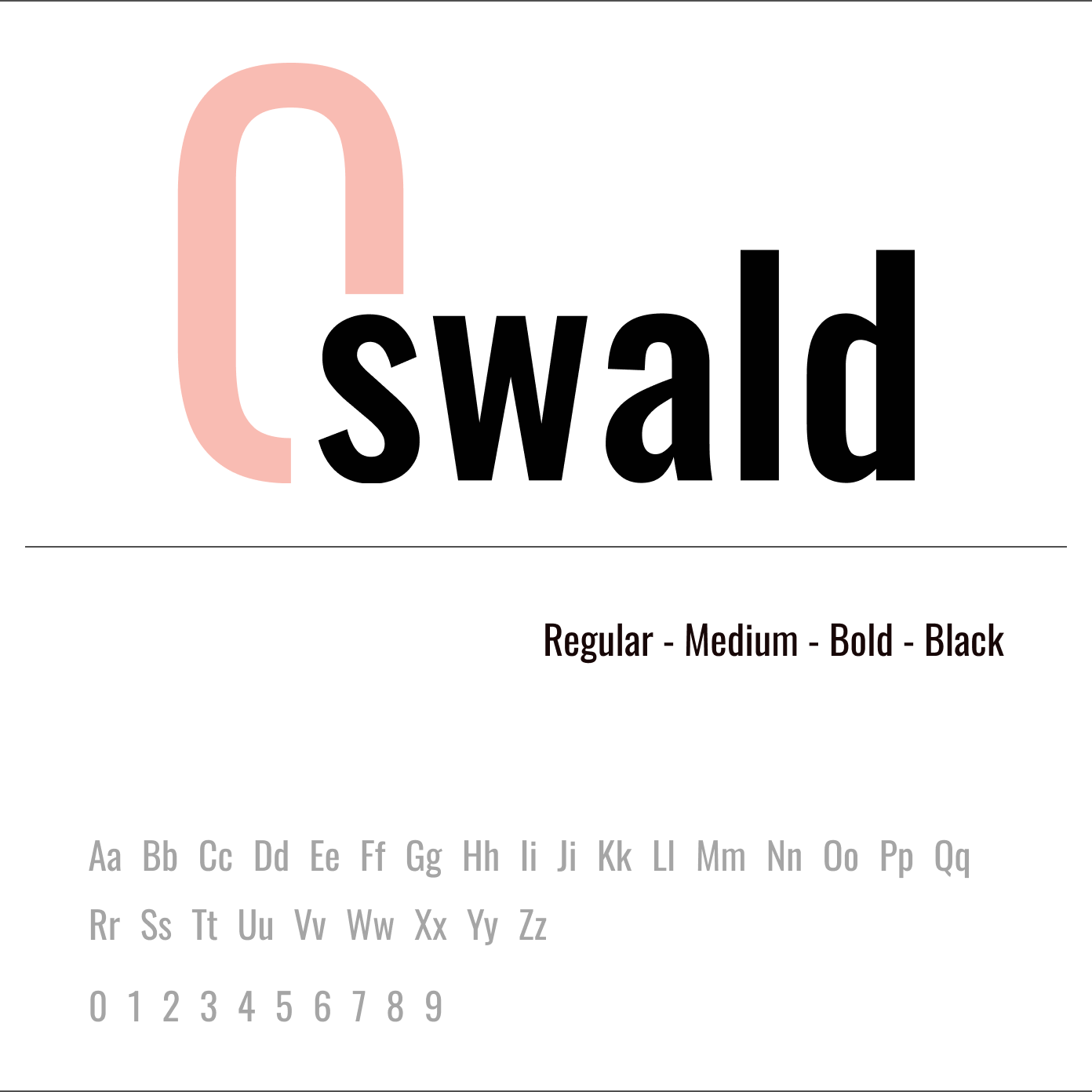
The current design has inconsistencies in font thickness, making the product text appear heavier than the header, affecting the visual harmony of the page. Additionally, the product image placement needs refinement to ensure proper alignment and clarity. The newsletter section also lacks visibility, reducing user engagement. Lastly, the color choices in certain UI elements, such as the shopping basket and wishlist, do not align well with the overall aesthetic.
02
Project goal
The primary goal is to refine the design by adjusting image positioning, ensuring font consistency, improving newsletter section visibility, and optimizing color choices for key UI elements. These enhancements will create a more polished, aesthetically pleasing, and user-friendly experience, ultimately strengthening the brand’s visual identity./h
THE SOLUTIONS
work process
This project involved teamwork between UX and UI designers to create an innovative solution. Our Business and Growth team stayed in constant communication, providing valuable insights throughout the process.
- Moodboard
- Visual direction concept
- Logo Refinement
- Style Guide
- UI Design
- Revision
- Figma Handover
[ 01 ]
Design system
Without a system, every change takes longer — this brings speed and clarity back.
[ 02 ]
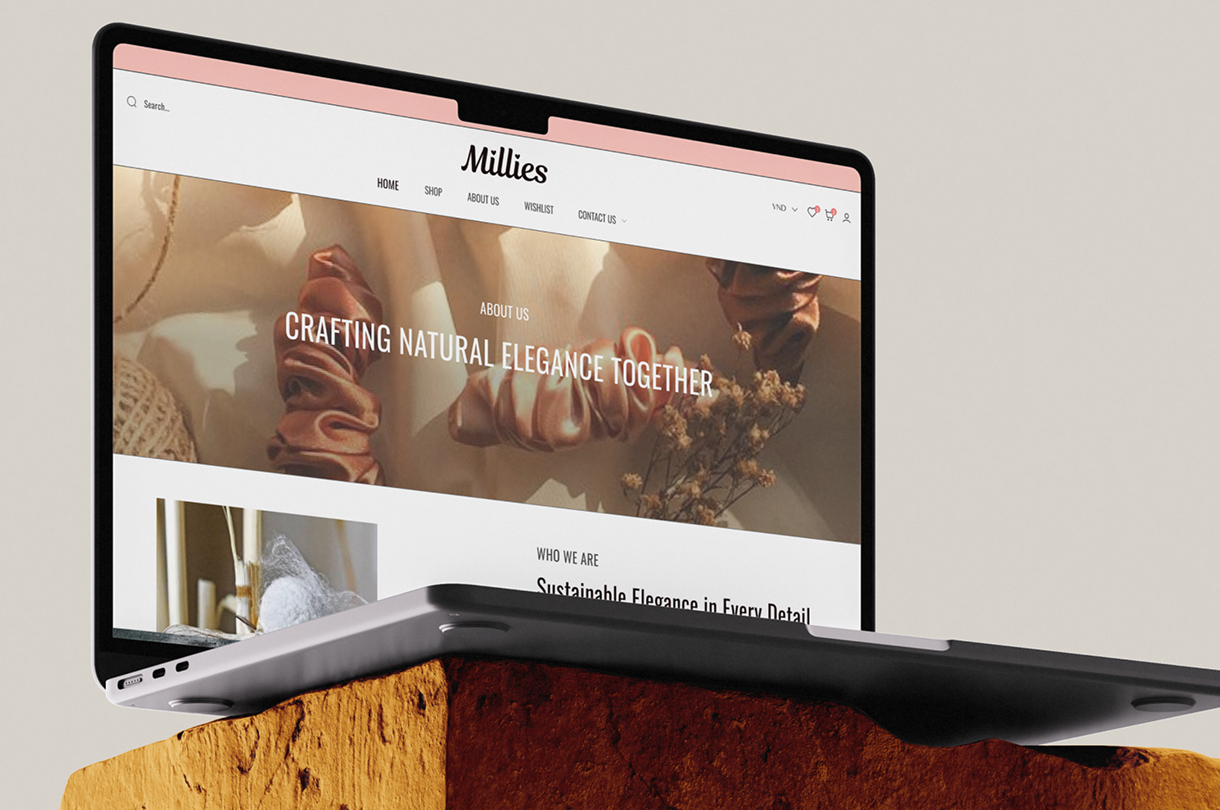
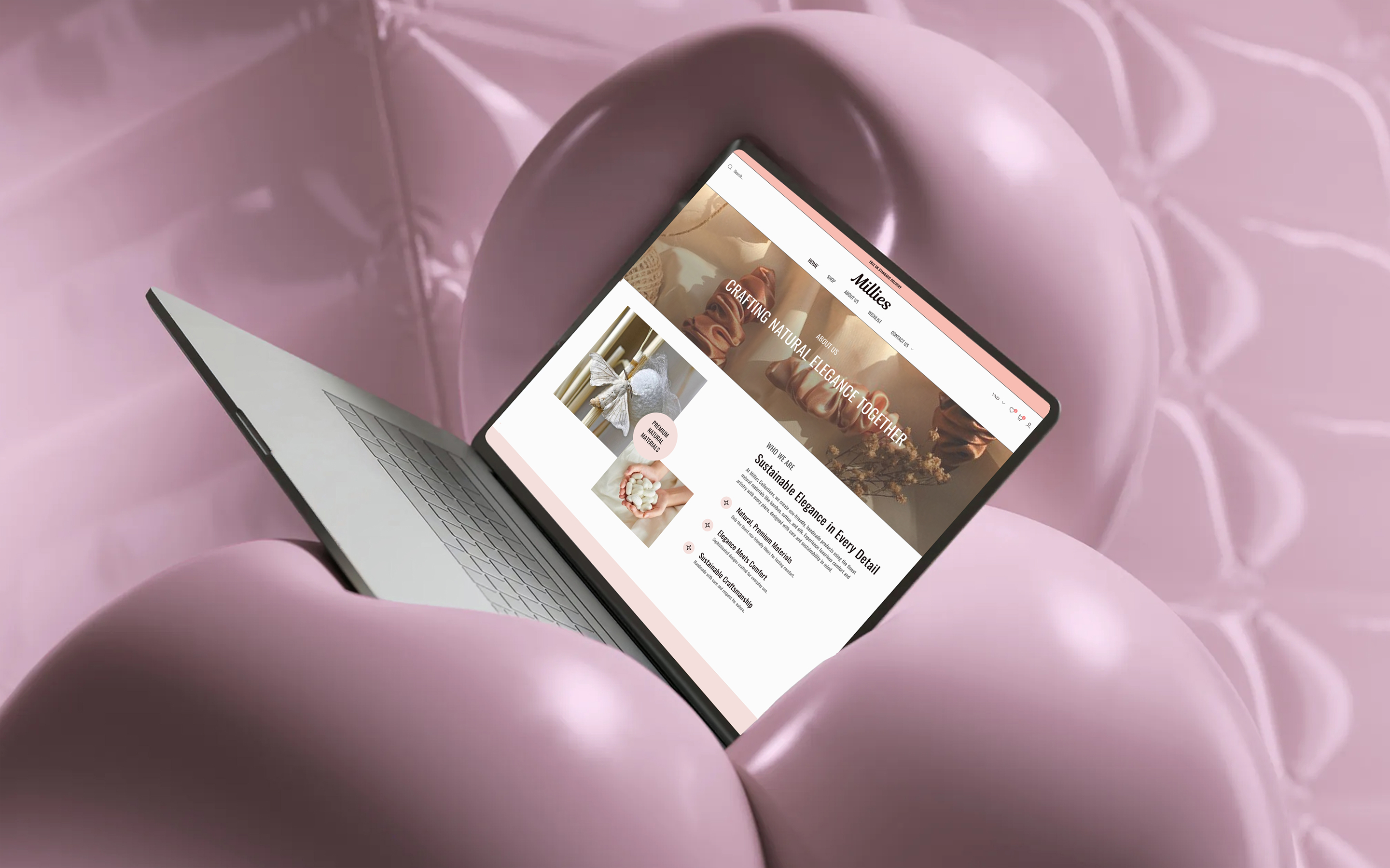
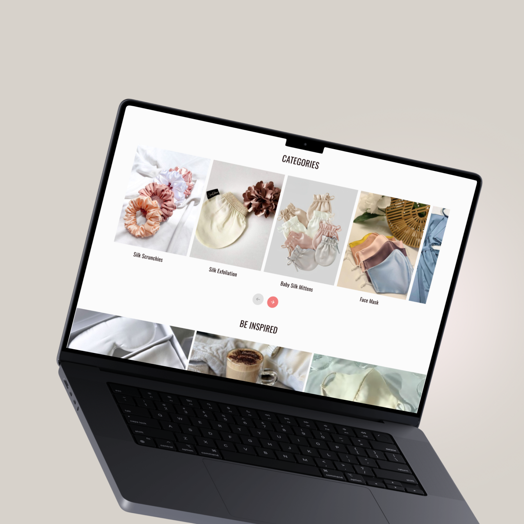
Website layout
Small visual inconsistencies were weakening the overall polish of the page — the layout was refined to bring better balance, clearer hierarchy, and a more cohesive shopping experience.


CONTACT US
Let us grow your business