Case Studies
What a UX Audit Revealed About Neurofrog’s AI Parenting App
Updated on:
15 September 2026
An AI parenting app has to do more than provide information. It has to help a parent recognise what matters, understand how it relates to their child, and decide what to do next.
That is a demanding product problem. Guidance needs to reflect a child’s developmental stage, make specialist knowledge accessible, and remain useful in the ordinary, interrupted moments of family life. More information does not necessarily make those decisions easier.
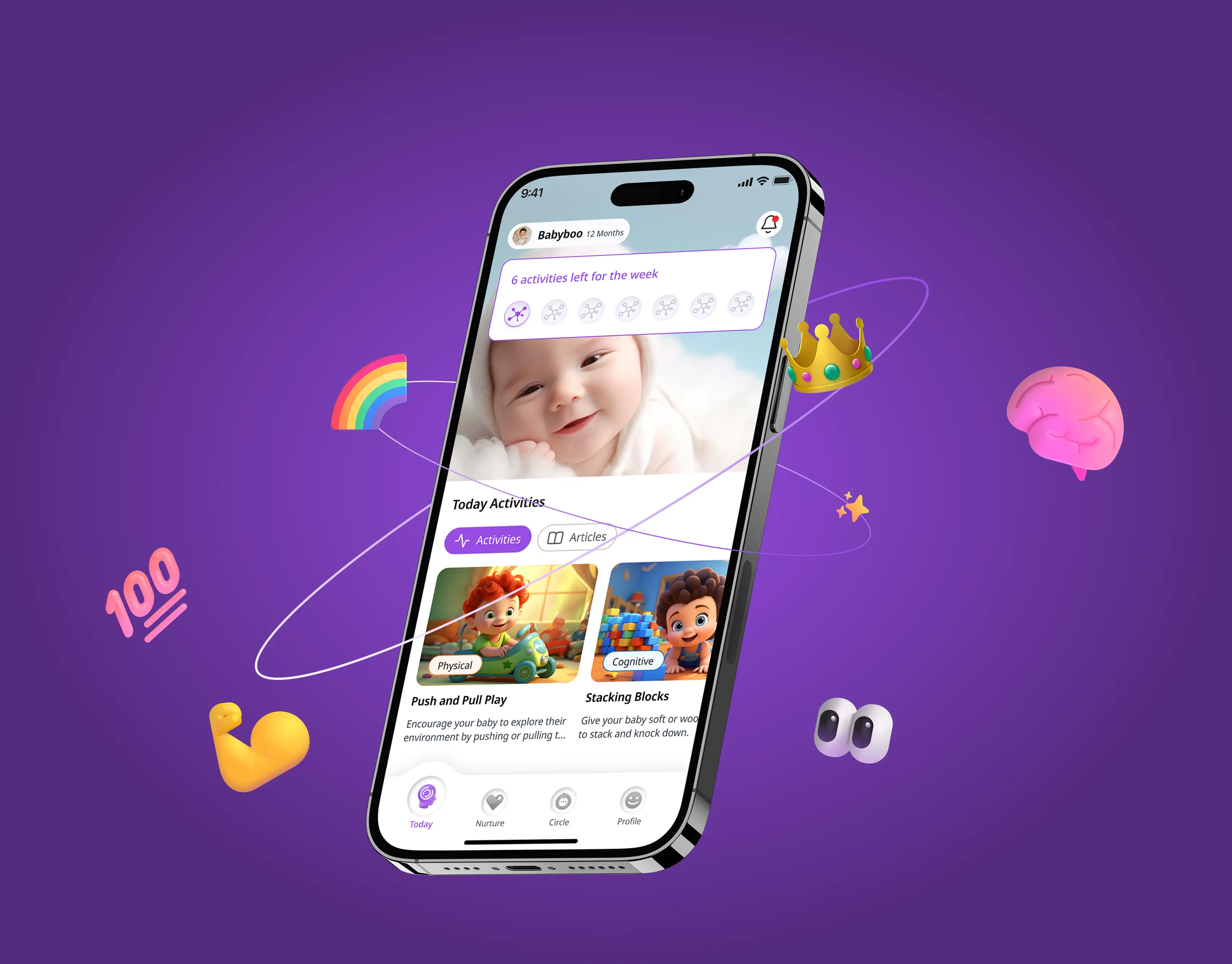
This was the challenge behind our work with Neurofrog, an AI-powered parenting support product built on developmental neuroscience. At Capi Product, our role covered auditing the existing experience, research, product restructuring, design, and validation.
The audit surfaced three connected issues: unclear product direction, overloaded key screens, and core features that needed clearer definition. Together, they pointed to a structural UX problem rather than an isolated interface problem.
The context: bringing neuroscience into everyday parenting
Neurofrog focuses on helping families apply developmental neuroscience during early childhood. Its public offering combines science-backed resources, stage-matched activities, and AI-powered support. The product sits between specialist knowledge and everyday decisions: what a parent wants to understand, what their child needs at a particular stage, and what they can practically do.
The company also has a documented relationship with Vietnam’s Cộng Đồng Bầu. Education New Zealand describes their collaboration as a national-level partnership intended to give first-time parents access to a “First 1000 Days” curriculum through the Cộng Đồng Bầu Neurofrog application. This is the client’s broader context, not an outcome of Capi’s work.
For our engagement, the practical question was narrower: how could the product make its guidance easier to understand and act on?
1. The product needed a shared framework for growth
The first issue was the absence of a unified framework to guide how the experience should develop.
A product can contain individually useful features without giving users a coherent journey through them. Content, personalised guidance, community, and subscription features each introduce their own decisions. Unless their relationships are clear, adding capability can also add uncertainty.
For the team building the product, the same gap makes future decisions harder. Where should a new feature live? Which action should a screen prioritise? How should different parts of the experience connect?
These questions require a view of the product as a whole. Resolving each screen independently can produce decisions that work locally but do not fit together across the journey.
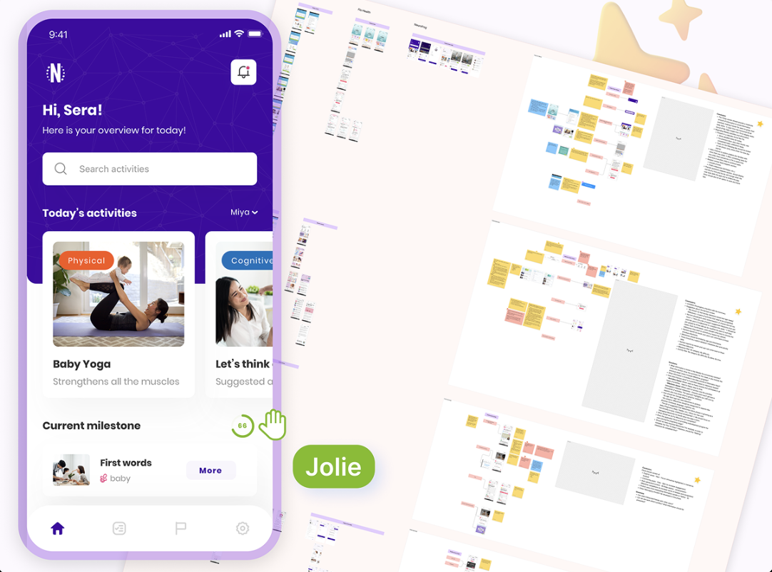
Our response was to restructure the sitemap and user flows, creating a clearer foundation for the child-development journey. This gave the interface design a direction: organising the experience around a coherent structure rather than treating every screen as a separate task.
2. Key screens carried too much information
The audit identified cluttered core screens that made it difficult to know what to prioritise.
In a knowledge-rich product, this is an understandable risk. There is a strong reason to include educational information, developmental guidance, and relevant actions. But the usefulness of each item does not guarantee that displaying them together creates a useful experience. A parent still has to work out what deserves attention first.
We focused on simplifying key screens around key actions and making the information hierarchy easier to follow.
That does not mean removing information indiscriminately. Especially in a specialist subject, removing context can weaken a product. A more useful goal is to organise information so that the next step is visible and supporting detail serves that step.
For Neurofrog, the design goal was a clearer sense of priority while preserving the product’s role as a source of developmental guidance.
3. Core features needed clearer definitions
The subscription model and community features also required clearer definition.
These are not minor details that can always be solved with better labels. They affect how people understand a product’s value and what they expect from using it.
A subscription introduces questions about access and benefit. A community feature introduces questions about participation and its relationship to the rest of the experience. When those decisions remain unresolved, interface design has to work around them.
This part of the audit reinforced a practical lesson: UX work sometimes needs to move upstream. Before a team can make a feature easy to use, it needs enough clarity about what that feature is supposed to do.
From audit findings to a testable redesign
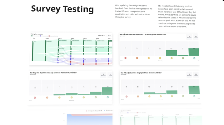
We began with research and an audit of the existing app. From there, we restructured the sitemap and user flows, developed visual concepts and a design system, and produced the UI and an interactive prototype. The redesigned experience was then evaluated through in-person interviews and online survey testing.
The order mattered. Structural work established how the product should fit together before visual design refined how it would appear.
Restructuring the journey
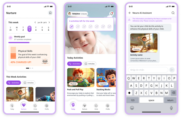
The sitemap and user flows helped organise the experience around the child-development journey. The design goal combined clearer structure, simpler key screens, and guidance connected to developmental stages.
This also gave the team a better basis for evaluating individual screens. Which step does this screen support? Does its main action serve that purpose? Where does the user go next?
Establishing consistency
The design system created a shared visual language for the redesigned product. Familiar patterns can help people follow transitions between different types of content and interaction, while giving future design work a common foundation.
A design system does not resolve every product question. Its value depends on the clarity of the structure underneath it. In this project, it supported the framework developed through the audit and restructuring work.
Testing beyond internal design reviews
The interactive prototype allowed us to move from discussing the proposed experience to evaluating how people responded to it.
The design team already knows the intended relationships between features. A parent encountering the experience does not have that advantage. A flow that appears clear in an internal review still needs to be evaluated with users.
Interviews and survey testing provided a way to examine the redesigned experience from their side
What testing showed—and what it did not
Our published Neurofrog case reports:
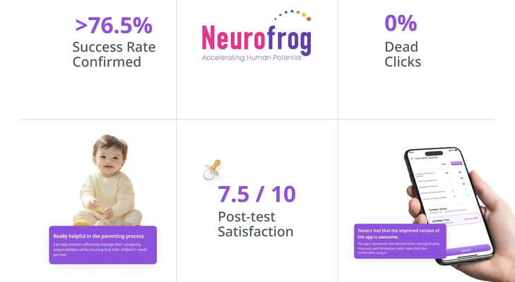
- 76.5% success rate during survey testing.
- 7.5 out of 10 post-test satisfaction.
- 40% faster task completion in testing.
These are test-stage results reported by Capi, not verified improvements in production retention, revenue, or child development. The public case does not include the full sample sizes, task definitions, or comparison methodology, so the figures should be read with that limitation.
Prototype testing and live product measurement answer different questions. Testing can assess whether people understand an experience and complete the activities being evaluated. Production data is needed to examine adoption, repeat use, and longer-term outcomes.
Our reported results belong to the first category. Neurofrog’s partnerships and broader commercial progress are a separate story.
The wider lesson for AI product teams
Users encounter AI capability through a product: its navigation, hierarchy, language, feature definitions, and interaction patterns. Those choices influence whether people can find relevant guidance and understand what to do with it.
In this engagement, the documented issues concerned product direction, information hierarchy, and feature clarity. Addressing them required research, structural decisions, design, and validation.
Before expanding a roadmap, it is worth asking: is the product missing a capability, or is it making an existing capability difficult to use?
Some products genuinely need better underlying functionality. Others need a clearer way to help users access and apply what is already there. An audit helps investigate that distinction before the team commits to another round of development.
When an audit deserves a place on the roadmap
Consider a product audit when your team repeatedly encounters questions such as:
- Which action should users take first on this screen?
- How does this feature connect to the main user journey?
- Are we trying to solve confusion by adding more explanation?
- Does everyone on the team describe the feature’s purpose in the same way?
- Have we tested whether users understand the structure we have designed?
These questions do not automatically call for a full redesign. They indicate that the team may need a clearer diagnosis.
The next step might be a focused navigation change, a better-defined feature, a revised flow, or additional research. The purpose of the audit is to make that decision more informed.
What we took away
Making specialist knowledge useful requires decisions about how it is organised, when it appears, and how people interact with it. Those decisions become especially important when a product combines AI, personalised guidance, educational content, and supporting features.
Our contribution was to examine the existing experience, identify structural issues, and translate those findings into a redesigned product that could be tested.
For teams building similar products, a useful starting point is to ask whether users can already find, understand, and use the value the product offers. The answer can clarify what deserves investment next.
Working through similar questions in your AI or SaaS product? Explore our Neurofrog case study for a closer look at the audit, design, and testing work, or connect with Capi Product to discuss your product challenges.
Sources and project context
- Capi Product: Neurofrog project scope and reported testing outcomes
- Neurofrog: product overview
- Education New Zealand: Quarter Two Report, partnership context
YOU MAY ALSO LIKE
Let us
GROW
.webp)
your

business!