Product & UX Strategy
They Added It to Their Cart. What Made Them Change Their Mind?
Updated on:
21 September 2026
A shopper sees an ad, visits your website, finds a product, chooses the right option, and adds it to their cart. Your business has already accomplished several things: earned their attention, sparked interest, and brought them closer to a purchase.
A few minutes later, they leave.
Your dashboard records an abandoned cart. For the shopper, there may be a very specific story behind it: shipping costs more than expected, the delivery date is unclear, an account is required, or the payment form keeps rejecting their details without explaining how to fix them.
Improving conversion starts with understanding that story. When we see only an unfinished transaction, it is easy to reach for the same response to different problems: another email, a discount, a pop-up, or a retargeting campaign. These interventions can help, but their effectiveness depends on why the shopper left.
Baymard Institute's compilation of 50 studies puts average cart abandonment at approximately 70.22%. In a separate survey, 42% of US online shoppers reported abandoning a cart because they were browsing or not ready to buy. These are different measurements. Neither means every store is losing 70% of orders that could otherwise be recovered. Source: Baymard Institute
Someone using a cart to compare prices may not have decided to buy. Someone who enters an address, selects a payment method, and encounters an error is in a different position. Treating both as the same conversion problem overlooks the question that matters: what does this person need to move forward?
Purchase intent can change after the item enters the cart
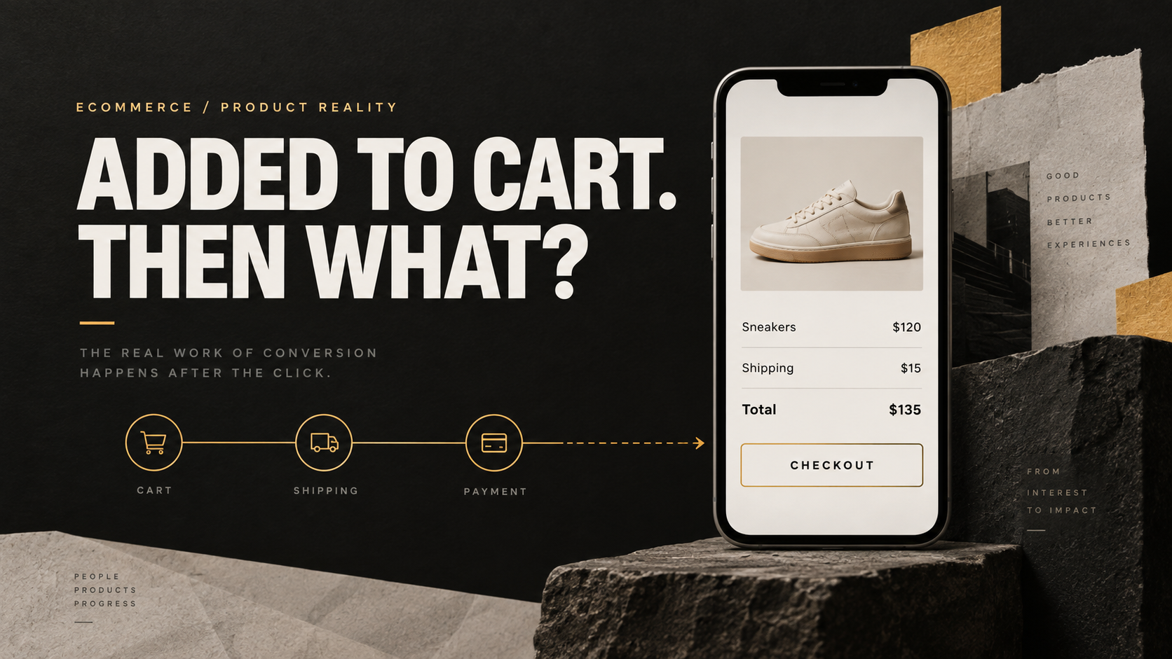
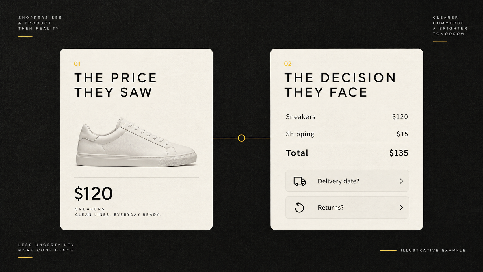
Consider a hypothetical example. A shopper finds a pair of sneakers for $120 in the right style and size. After adding them to the cart, they discover a $15 shipping charge, an uncertain delivery date, and a possible fee for exchanging sizes.
The product has not changed. The decision has. What began as “Are these sneakers worth $120?” has become “Is the total cost and risk of this purchase acceptable?” The illustrative total is now $135 before any applicable tax, and the shopper still has unanswered questions.
A more prominent checkout button may do little here. The shopper needs information to reassess the purchase.
In Baymard's reported reasons for abandonment, excluding the browsing category, 40% cited excessive additional costs, 20% slow delivery, and 12% an inability to see or calculate the total cost upfront. These reasons can overlap. They are survey responses, not a universal breakdown of why customers leave every store. Source: Baymard Institute
Businesses need to distinguish between an unattractive purchase offer and an offer that has not been explained clearly. If shipping is genuinely too expensive, design needs support from operations and commercial teams. If the price is reasonable but appears only at the last step, presenting it earlier may help shoppers decide with better information.
Design cannot turn seven-day delivery into two-day delivery. It can help customers see an estimated arrival date before they spend time entering all their details.
That clarity matters even when some shoppers decide to leave earlier. It prevents a long checkout journey that ends with the discovery that the purchase was never suitable.
Answer the questions that still stand between interest and purchase
When reviewing an ecommerce page, layout, photography, colors, and calls to action tend to attract attention first. To judge whether the page supports a purchase decision, we need more specific questions.
Can a clothing shopper choose a size confidently? Can an electronics buyer confirm compatibility with the device they already own? Can someone buying a gift tell whether it will arrive before the occasion?
These are examples of audit hypotheses. Each category has different concerns, and those concerns need to be checked with the business's actual customers.
If shoppers repeatedly ask customer support whether an item can be returned, that is a signal to investigate. The returns policy may be unsuitable. Alternatively, a reasonable policy may be difficult to find or written in language that leaves people uncertain. Those situations require different interventions.
An extra “Buy today” message does not answer a question about returns. A longer product description may not help if the relevant information remains hard to locate.
A useful test for product-page content is simple: after reading it, what part of the purchase can the customer decide more confidently?
A shorter checkout is not automatically easier to complete
When shoppers leave during payment, reducing the number of steps is an understandable response. Replacing four screens with one appears to make the journey faster.
However, Baymard's research finds that the number of fields users must consider matters more to checkout usability than the step count alone. Placing the entire form on one page does not automatically reduce the work involved. Source: Baymard's research on checkout form fields
A single page can still ask for excessive information, present confusing choices, and make errors difficult to locate. A clearly structured sequence may allow shoppers to concentrate on one task at a time.
An audit should therefore examine the work customers actually perform. Which fields are needed to process the order? Which serve an internal data-collection preference? Must shoppers enter information they have already provided? When something goes wrong, can they identify the problem and recover?
Imagine a shopper entering a valid phone number with spaces. The form responds with “Invalid information.” The shopper must guess which format the website accepts.
The appropriate change might be to accept reasonable formatting variations or explain the correction next to the field. Redesigning the entire checkout would require more effort without necessarily addressing that cause.
These details are part of product quality: does the system help people complete a task when they enter information naturally?
Some conversion improvements are almost invisible
Website performance offers a useful example.
In a case study published on web.dev, Rakuten 24 split traffic between two versions of a landing page for one month. The versions retained the same appearance and functionality, while one was optimized for Core Web Vitals and related performance metrics. The reported results included a 33.13% relative increase in conversion rate and a 53.37% increase in revenue per visitor. Source: Rakuten 24 case study
These were results from a particular experiment, not gains every website should expect. Several performance metrics improved, so the outcome should not be attributed to a single speed change. The useful lesson is the method: keeping the visual and functional experience comparable while assessing the optimized version.
This broadens the scope of a conversion audit. Alongside content and interaction flows, teams need to examine the devices, browsers, and connection conditions their customers actually use.
A checkout that works well on a developer's desktop still needs testing on a phone. A slow response to a tap or a layout that moves as content loads is part of the buying experience, too.
Connect the numbers to the behavior
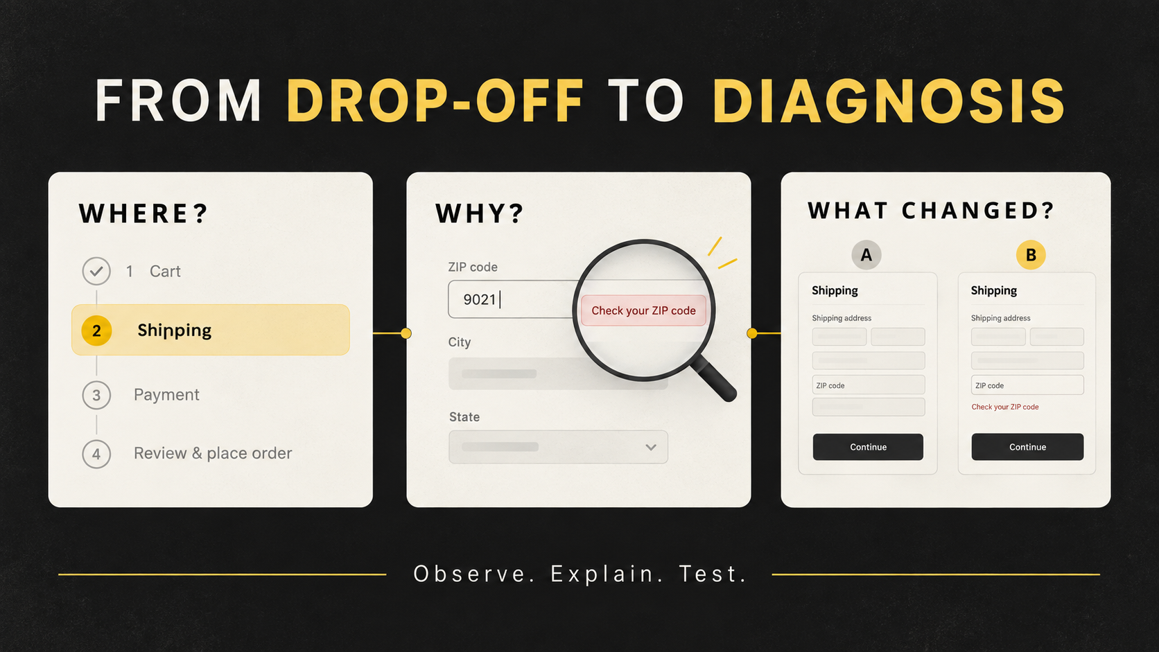
Suppose a report shows that many shoppers leave at the address step. The data has identified where to investigate, but not necessarily why.
The location selector may be broken. Shoppers may have just discovered the shipping cost. Their address may be outside the delivery area. Or something outside the website may have interrupted them.
Baymard's checkout-audit guidance explains why analytics needs to be paired with an examination of the experience: a drop-off identifies a location in the journey, while the underlying friction requires further investigation. Source: Baymard's checkout audit guide
A practical approach combines step-level reporting with error logs, support feedback, and observation of people attempting the task. Each source contributes something different. Analytics indicates scale; logs reveal system failures; observation helps explain what the shopper understood and tried to do.
First, verify that the measurement itself is sound. If checkout-start events fire twice, or completed orders are not consistently recorded after a payment-provider redirect, the apparent abandonment rate may be misleading.
Once a problem is identified, the proposed change should be specific enough to test. “Make checkout simpler” leaves too much undefined. A clearer hypothesis would be: “New customers struggle to find guest checkout. Making that option easier to identify should increase the proportion who continue to shipping.”
That hypothesis names the audience, obstacle, proposed intervention, and expected result. The team can investigate whether the obstacle exists before investing in the solution.
Where traffic and transaction volume support a meaningful experiment, an A/B test can help assess impact. For a smaller store, observing task completion and fixing clearly evidenced failures may be a more practical starting point. Either way, a handful of extra orders over a short period does not establish that the new design caused an improvement.
Evaluate conversion in its business context
A website can generate more orders by offering steep discounts. If contribution margin deteriorates, the business may not be better off. A change can also make ordering faster while leaving shoppers less informed, potentially moving the cost downstream into cancellations, returns, and support requests.
Alongside purchase completion, evaluation should consider revenue per visitor, average order value, discount costs, and cancellation and return rates. The right measures depend on the business model, but the criteria should be established before the experiment begins.
Conversion also needs to be interpreted alongside the traffic mix. Consider a hypothetical store expanding advertising to people unfamiliar with the brand. Its overall purchase rate could fall even though the website has not changed. Treating that aggregate decline as proof of a checkout problem would start the optimization process with the wrong diagnosis.
Comparing traffic sources, devices, and customer groups helps identify who encounters the problem and under which conditions. It avoids assuming that every visitor arrives with the same needs or readiness to buy.
An abandoned cart does not immediately tell a business whether it represents a lost opportunity, a postponed decision, or a failed experience. Product teams need to establish the difference.
Sometimes the appropriate response is a different shipping policy. Sometimes it is clearer product information. Sometimes it is a small form fix that allows an already willing customer to pay.
Before finding another way to persuade people to buy, observe the people who are already trying. What information are they missing? What worries them? Where do they get stuck?
Those answers help a business decide which changes are worth making.
YOU MAY ALSO LIKE


Let us
GROW
.webp)
your

business!