Amazon
THE PROJECT

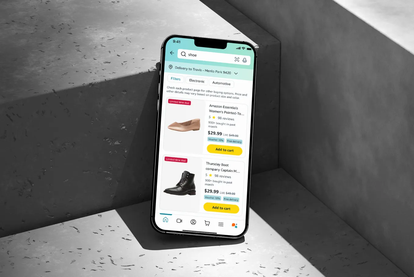
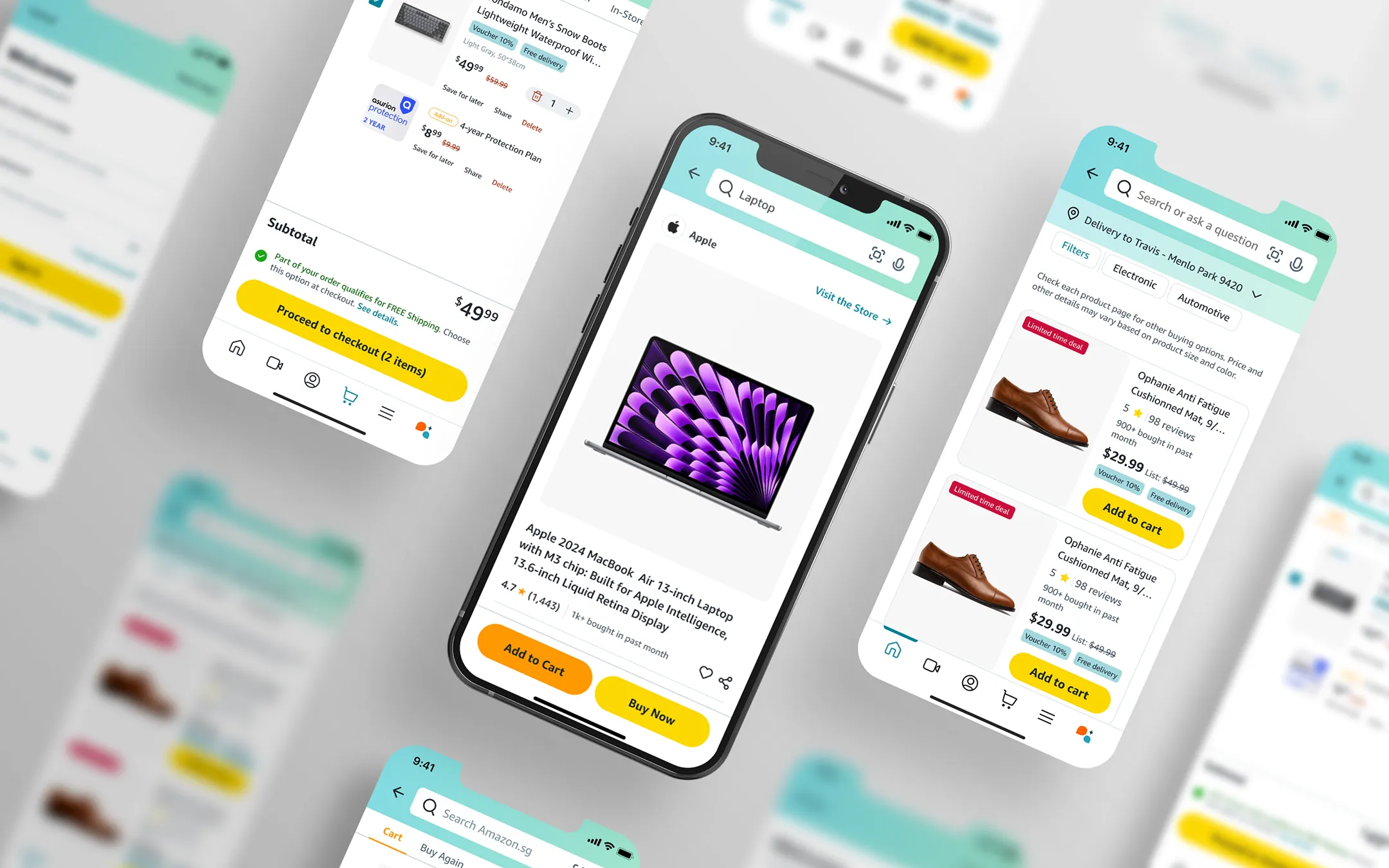
An independent UX exploration proposing improvements to the Amazon shopping app's search, product-tracking, and readability experience.
PROBLEM
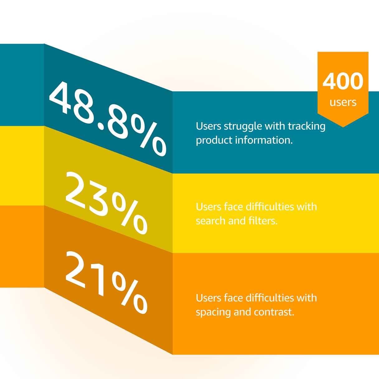
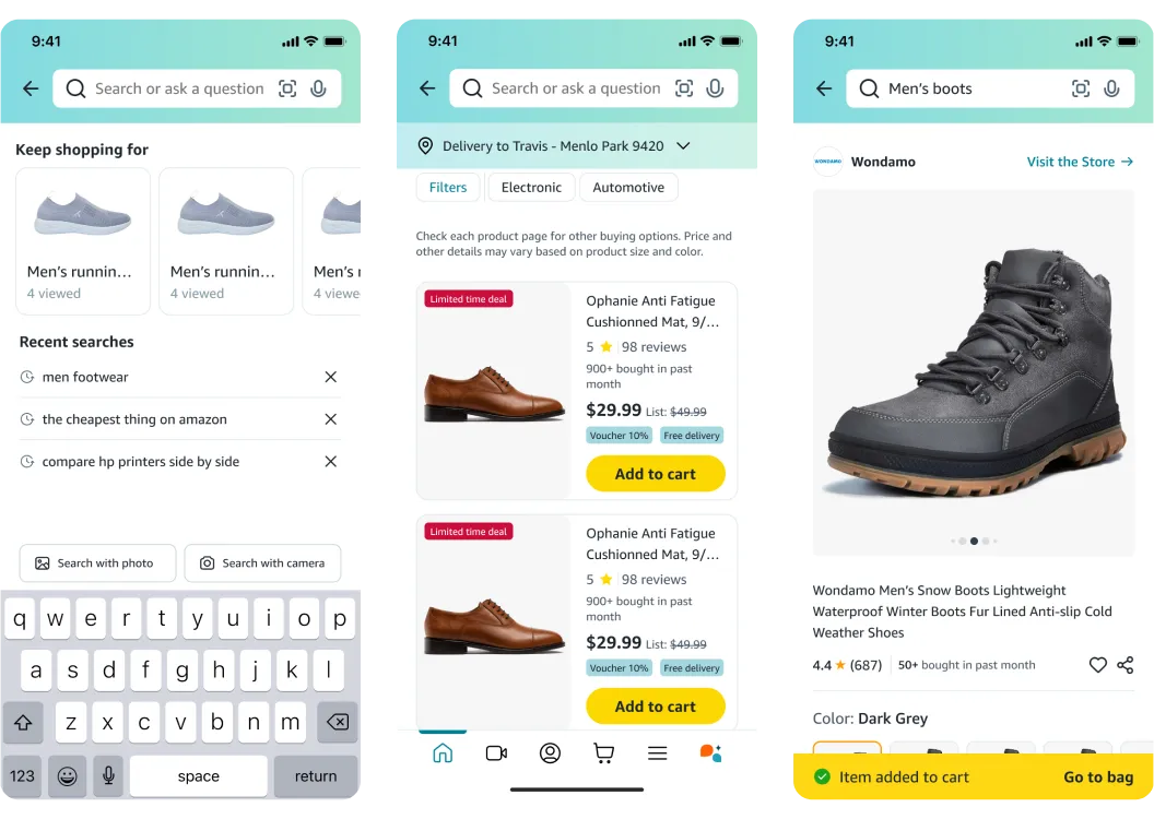
Search & filtering friction: finding the right product among Amazon's huge catalog is harder than it should be.
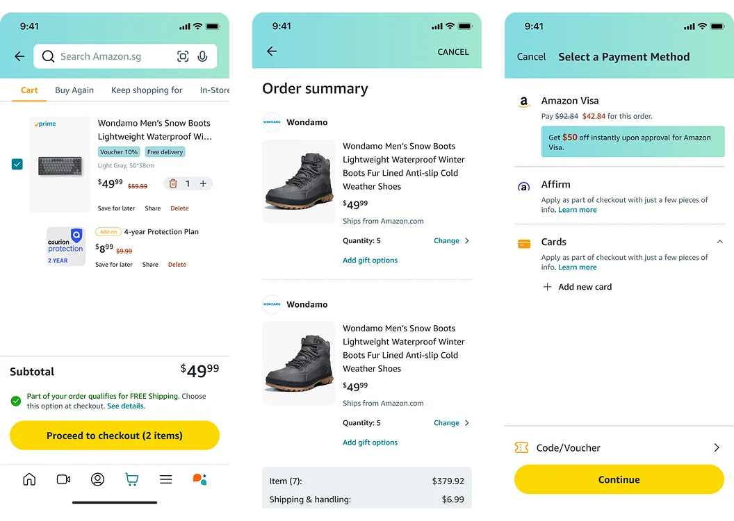
Cluttered product tracking: dense layouts make it hard to keep track of orders and product details.
Readability issues: poor spacing and contrast hurt overall clarity and slow users down.

GOAL
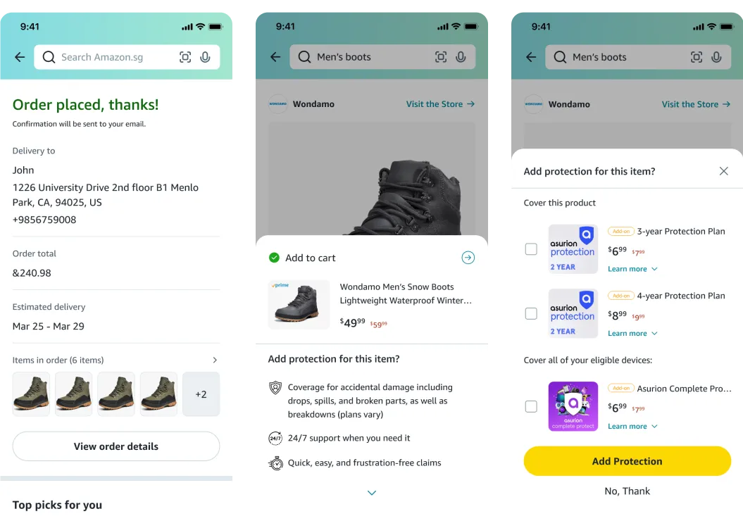
Improve search efficiency, product information clarity, and visual readability to create a more seamless shopping experience that increases satisfaction and engagement.

APPROACH
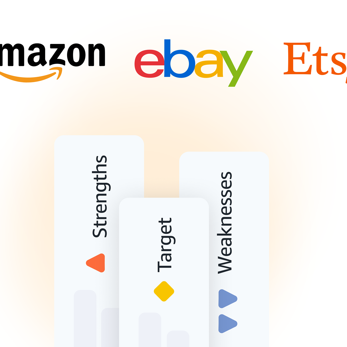
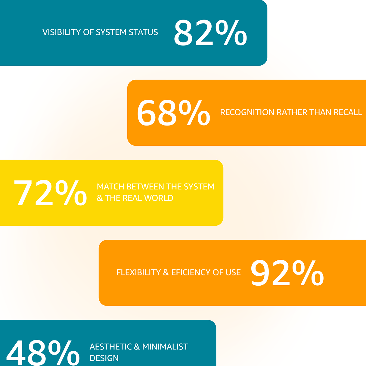
We grounded the redesign in research — analyzing 400 Google Play reviews plus a competitive audit against Etsy and eBay, and running a heuristic evaluation of the current app — before mapping user flows, wireframing, and refining the visual direction and UI.

to Solve the Challenge
Research & Audit
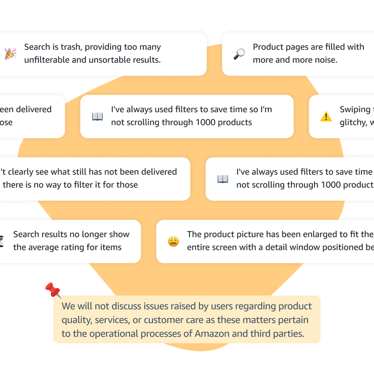
Analyzing 400 Google Play reviews, a competitive audit (Etsy, eBay), and a heuristic evaluation revealed key UX issues in search, product tracking, and readability, highlighting areas for improvement.
Visual direction
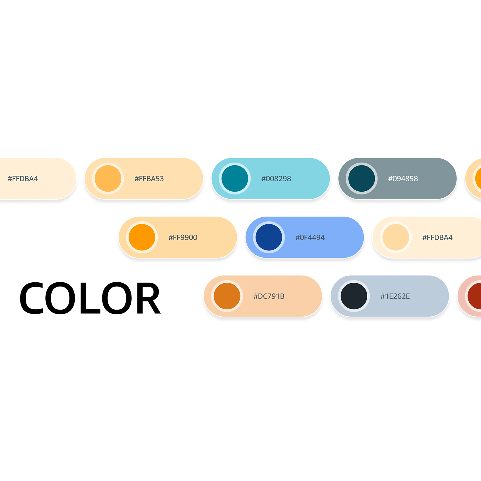
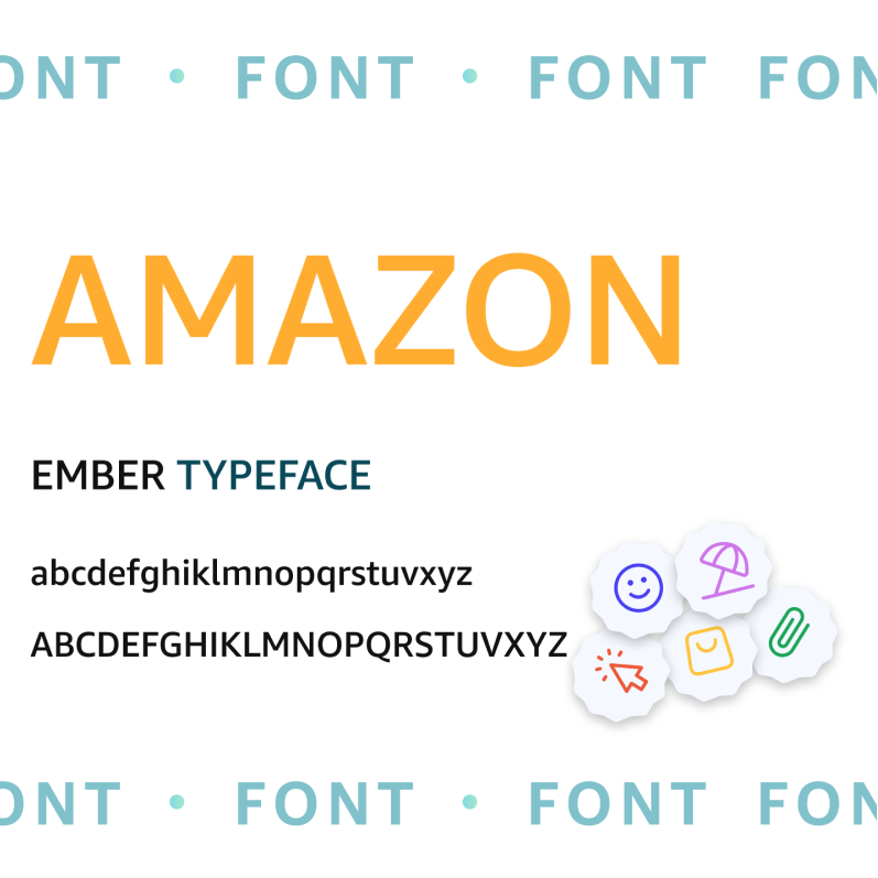
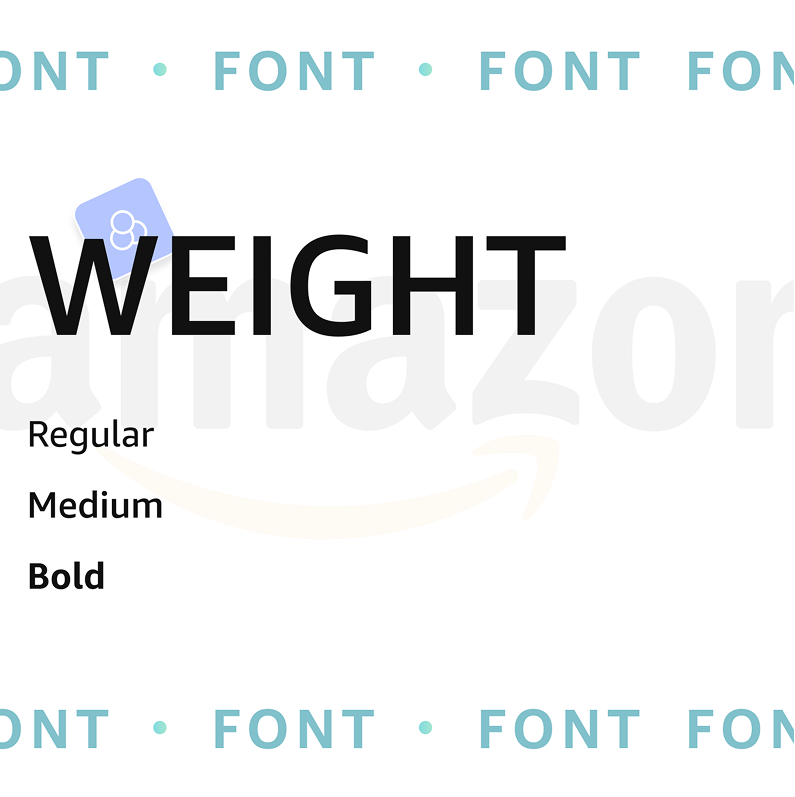
Color & Tone Iconography & typography system optimized for low-light environments
IMPACT & OUTCOME
~20%
faster product discovery
~15%
improvement in perceived readability from better spacing and contrast.
Grounding the redesign
in 400+ real user reviews kept decisions tied to pain points.
A clearer information hierarchy
reduced clutter across screens.





Let us
GROW
.webp)
your

business!