Piver
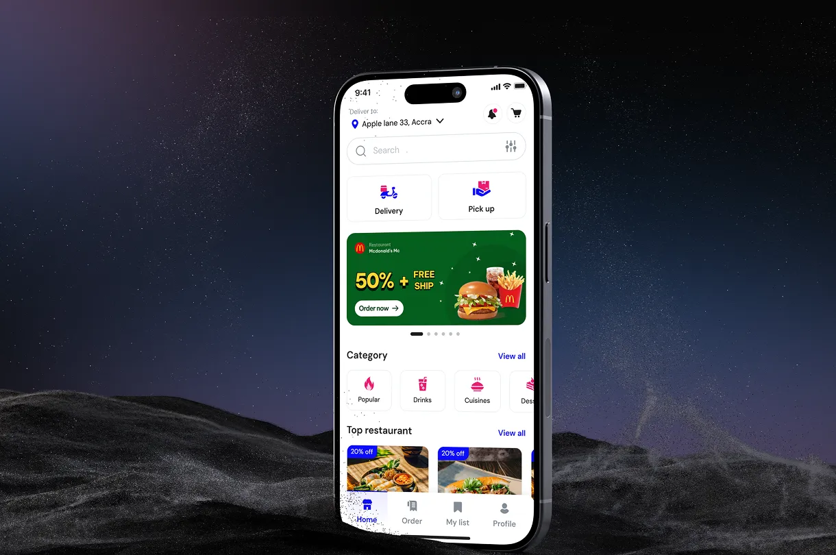
THE PROJECT
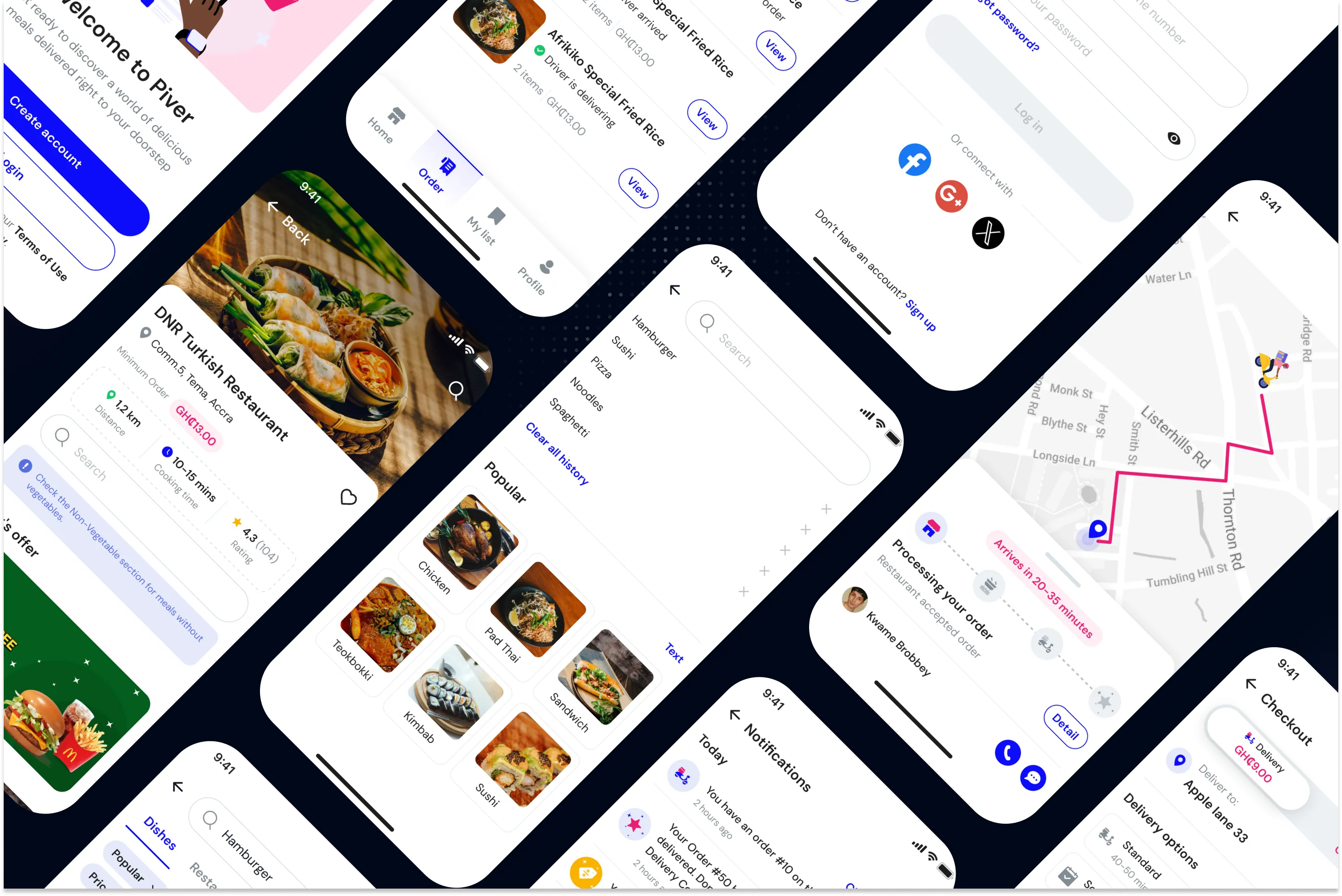
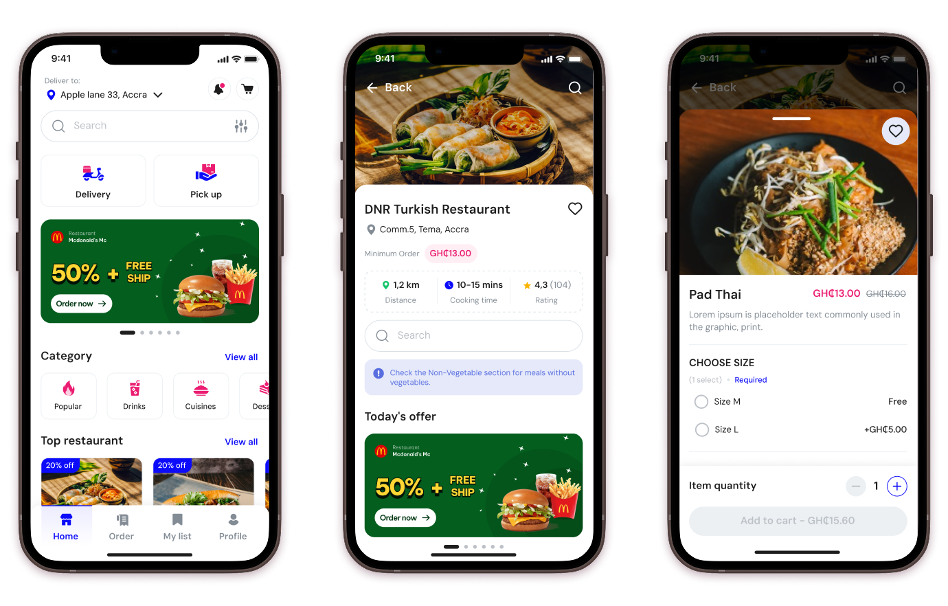
With a wide range of cuisines and partners across Africa, Piver needed a UI that could showcase its scale while keeping ordering fast and simple.
PROBLEM
Scale without structure: the platform has a large network of partners, but the interface didn't present that scale clearly.
Hard to browse: with so many options, users struggled to quickly find what they needed.
Fragmented ordering journey: the lack of structure broke up the path from browsing to placing an order.

GOAL
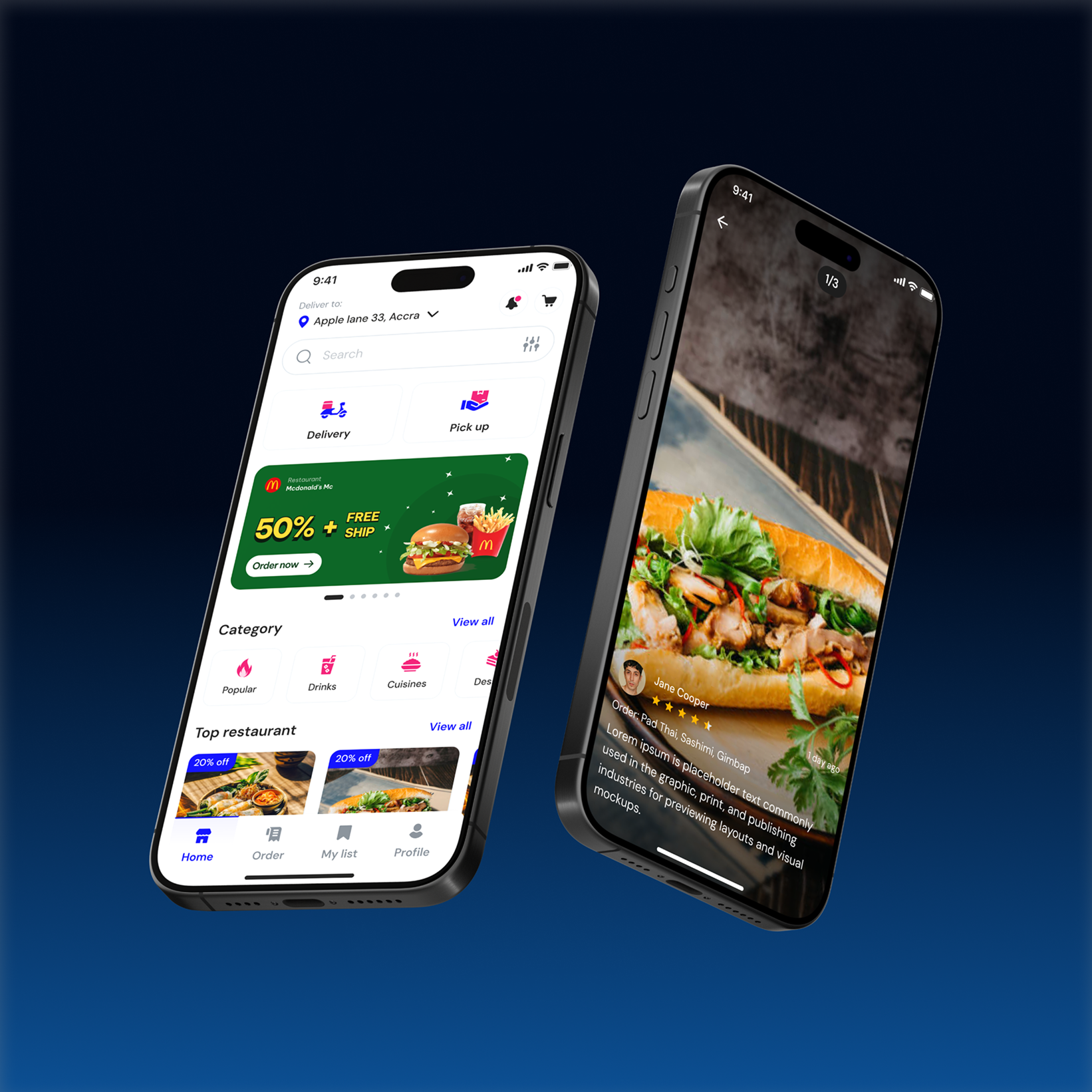
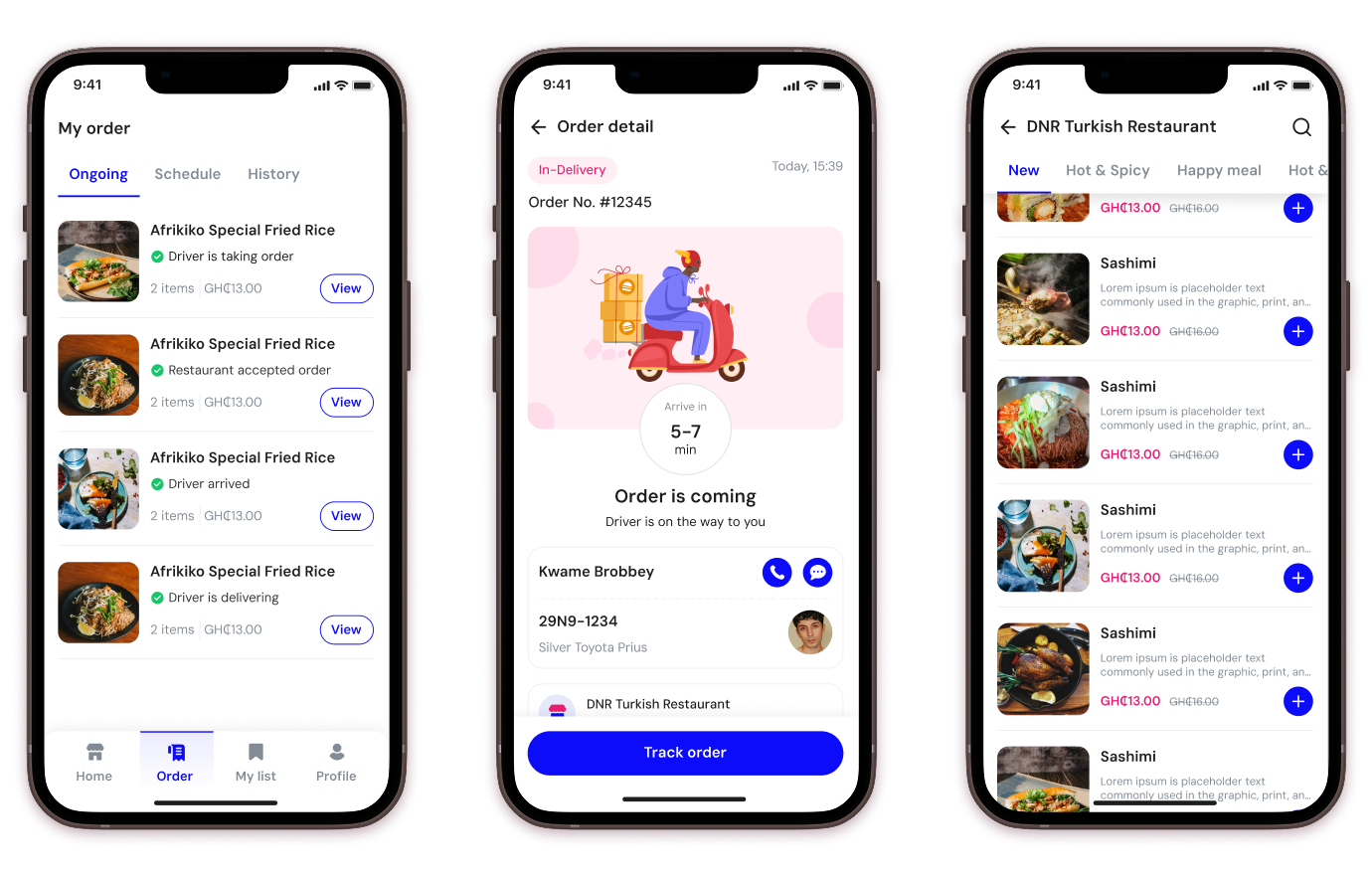
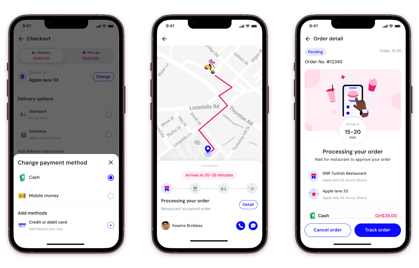
Redesign the interface to be more structured, modern, and user-friendly — showcasing the marketplace's variety while enabling seamless discovery and ordering.

APPROACH
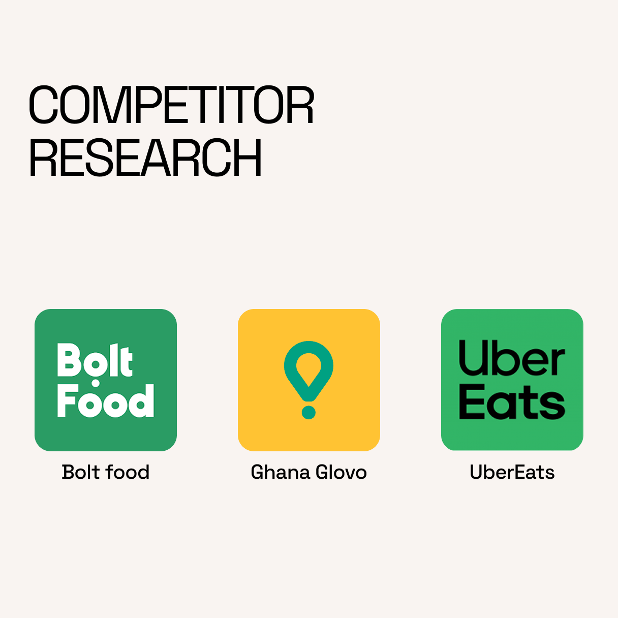
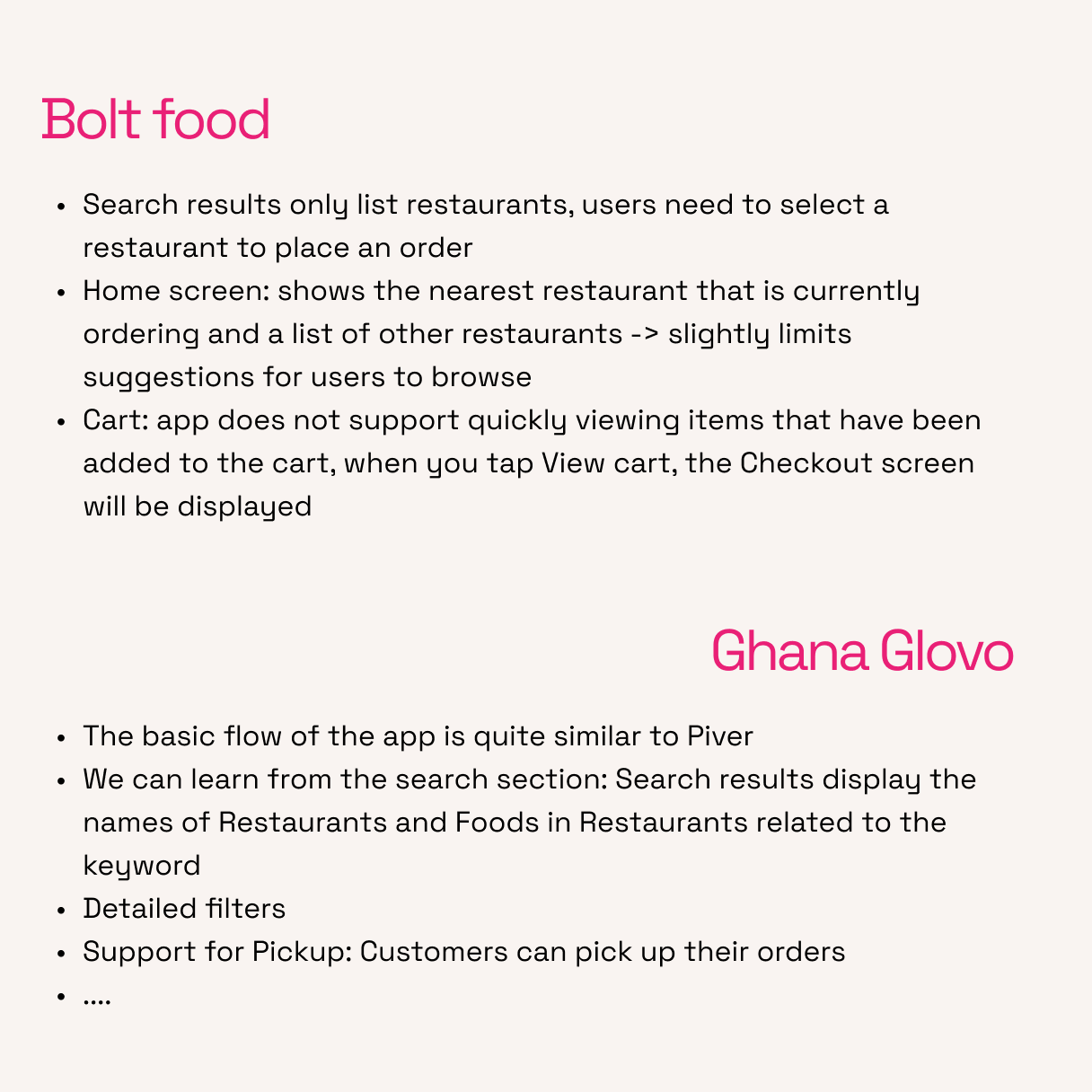
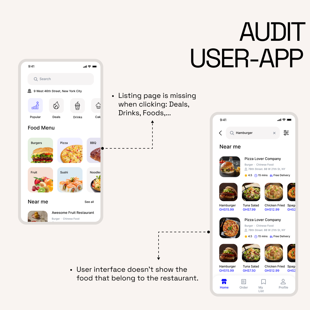
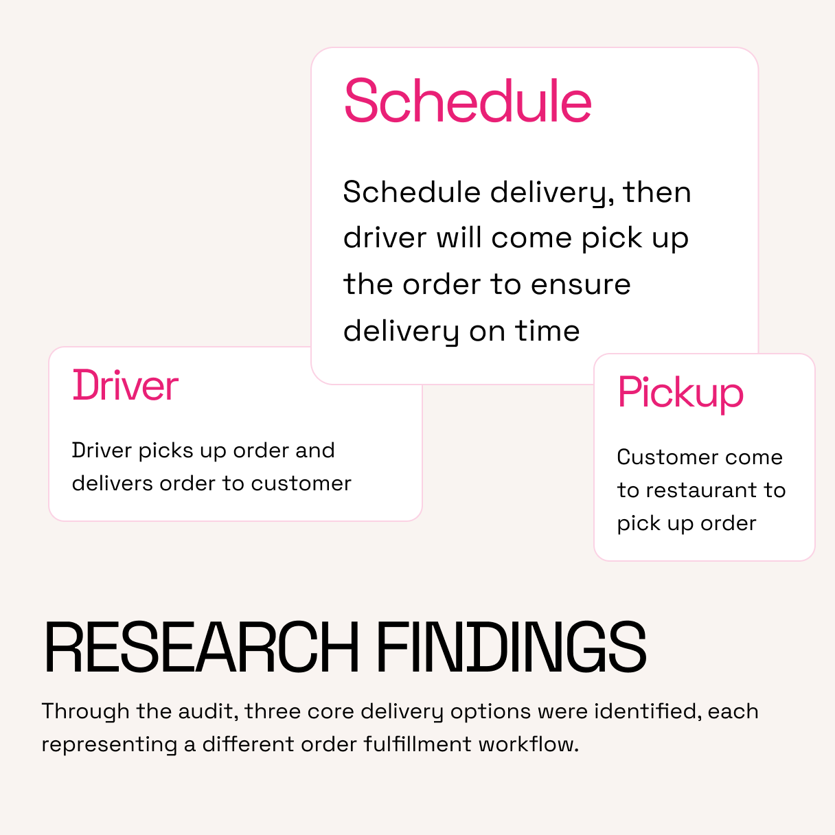
After brief onboarding, competitor research, and a current-app audit, we mapped the flow diagram and moodboards before building a design system and UI. The layout prioritizes easy navigation, clear content hierarchy, and quick access to key actions.

to Solve the Challenge
Research
In-depth market research was conducted to understand user needs, behaviors, and expectations. The insights helped shape design decisions and align the product with real user problems.
Design system
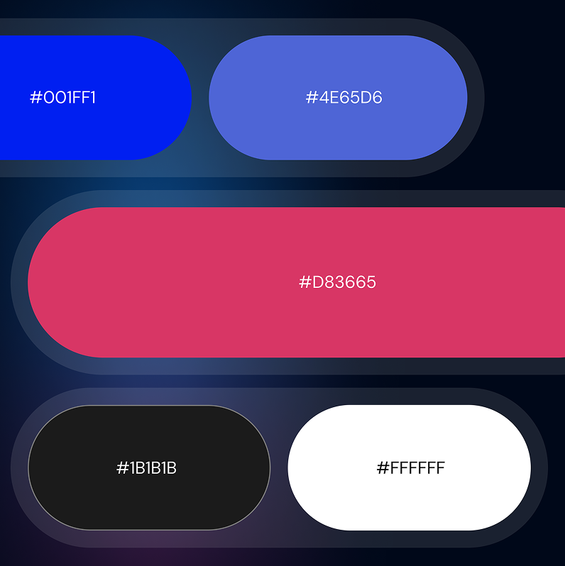
Without a system, every change takes longer — this brings speed and clarity back.

IMPACT & OUTCOME
Clearer navigation
reduced the steps between screens
~20%
faster browse-to-order time from a clearer content hierarchy.
~15%
increase in order-completion rate, when apps simplify discovery flows.
Structured layout
made 2,000+ partners easier to browse and compare.





Let us
GROW
.webp)
your

business!