SanaMente
THE PROJECT
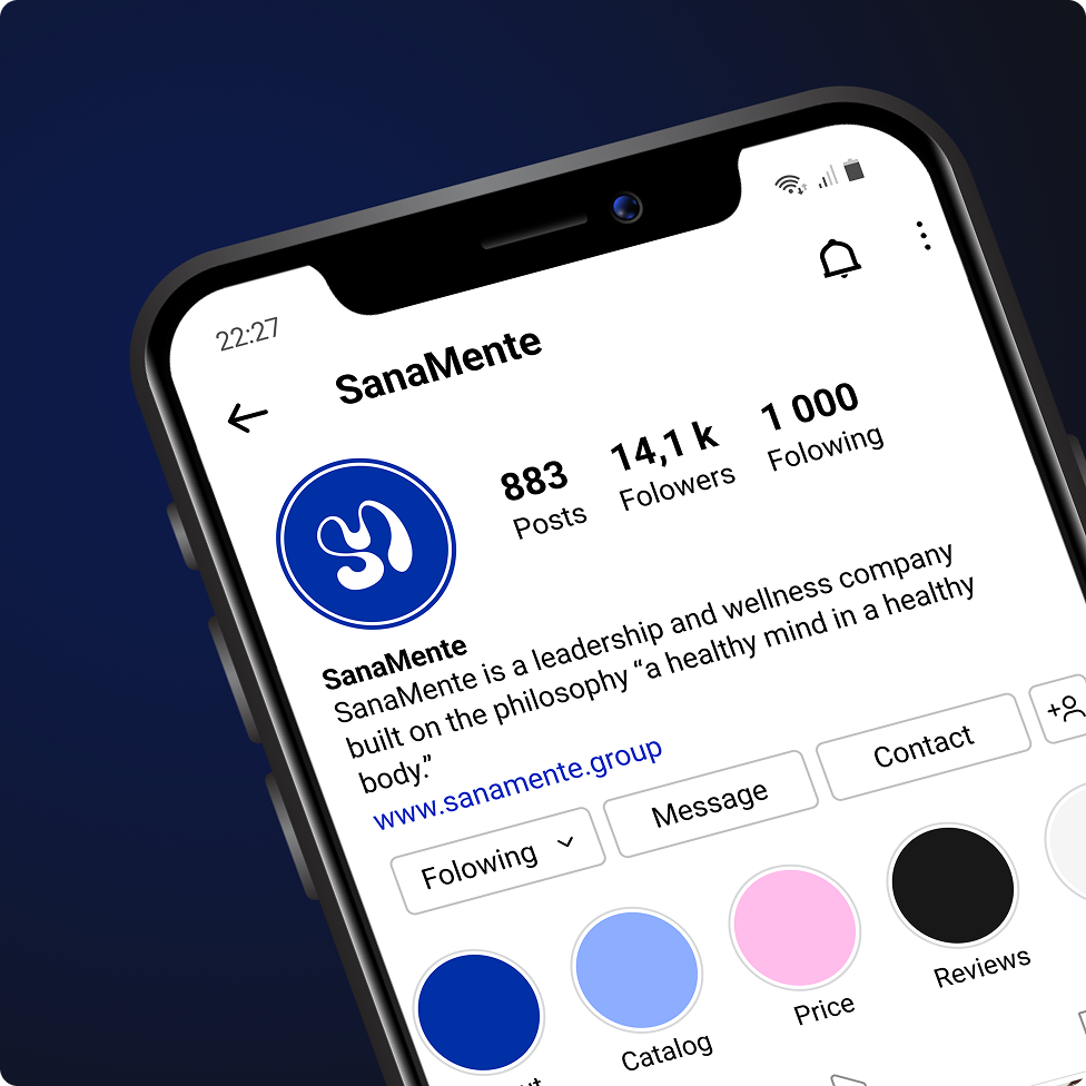
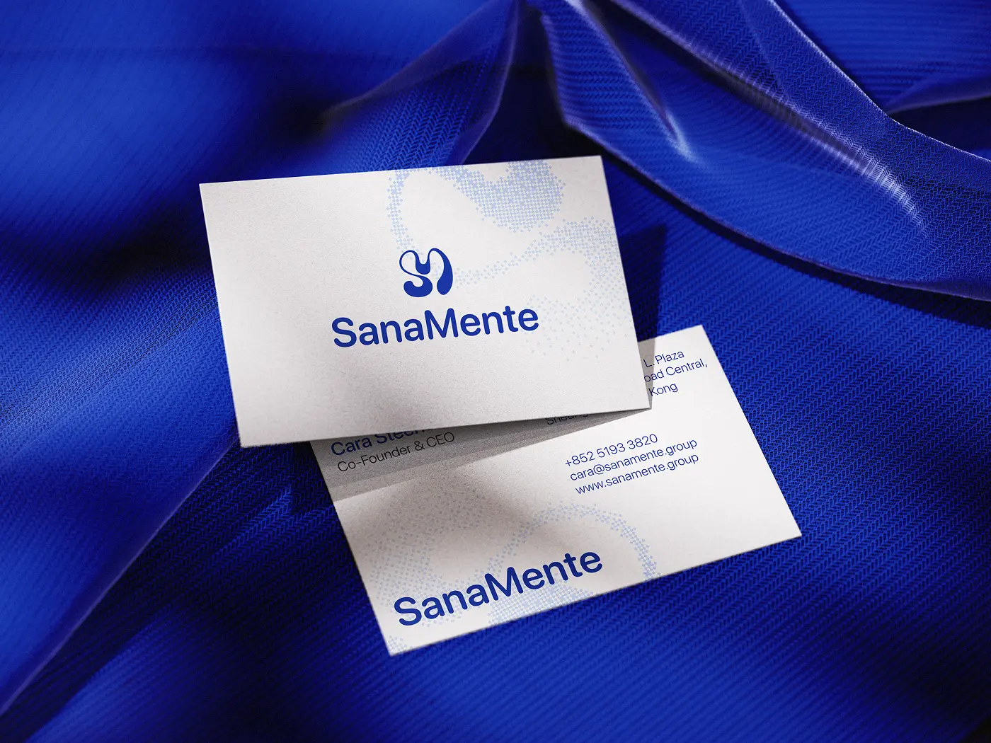
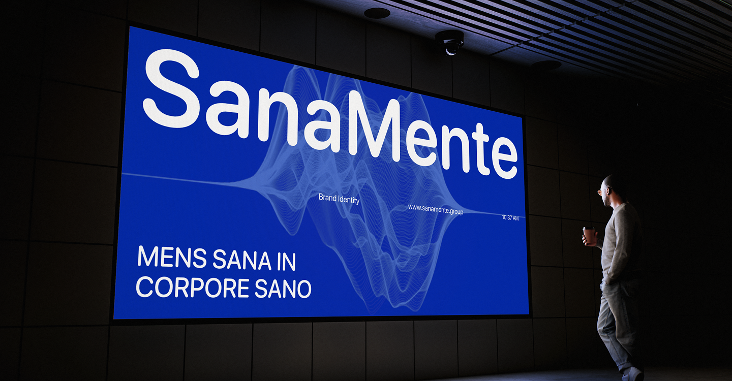
SanaMente is a leadership and wellness company guided by the philosophy of "a healthy mind in a healthy body." It blends neuroscience, personal coaching, and holistic training to help people and organizations grow sustainably.
PROBLEM
Carrying the philosophy: The brand identity had to embody SanaMente's core idea — a healthy mind in a healthy body
Professional yet human: The identity needed to feel credible and professional while staying warm and deeply human.
Standing apart: In a wellness space where brands often look alike, SanaMente had to feel distinct and recognizable.

GOAL
The goal is to create a logo that embodies SanaMente's philosophy "a healthy mind in a healthy body", reflects professionalism, stands out from competitors, and remains simple, modern, and adaptable across all platforms, including app icons and favicons.

APPROACH
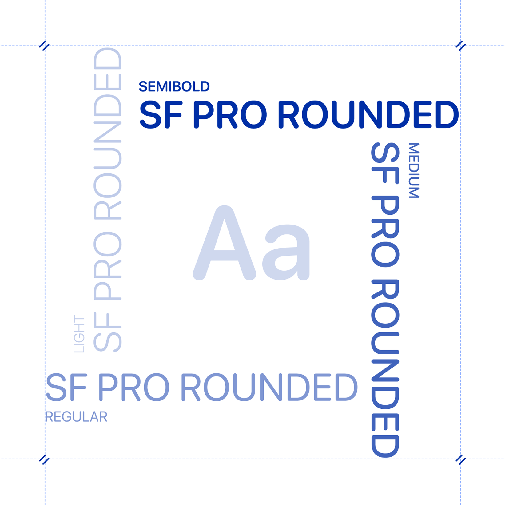
We approached SanaMente as a branding project rooted in meaning — letting the philosophy drive the design rather than decoration. Every decision, from the core symbol to the typography, was made to express the balance between mental strength and physical vitality that SanaMente stands for

to Solve the Challenge
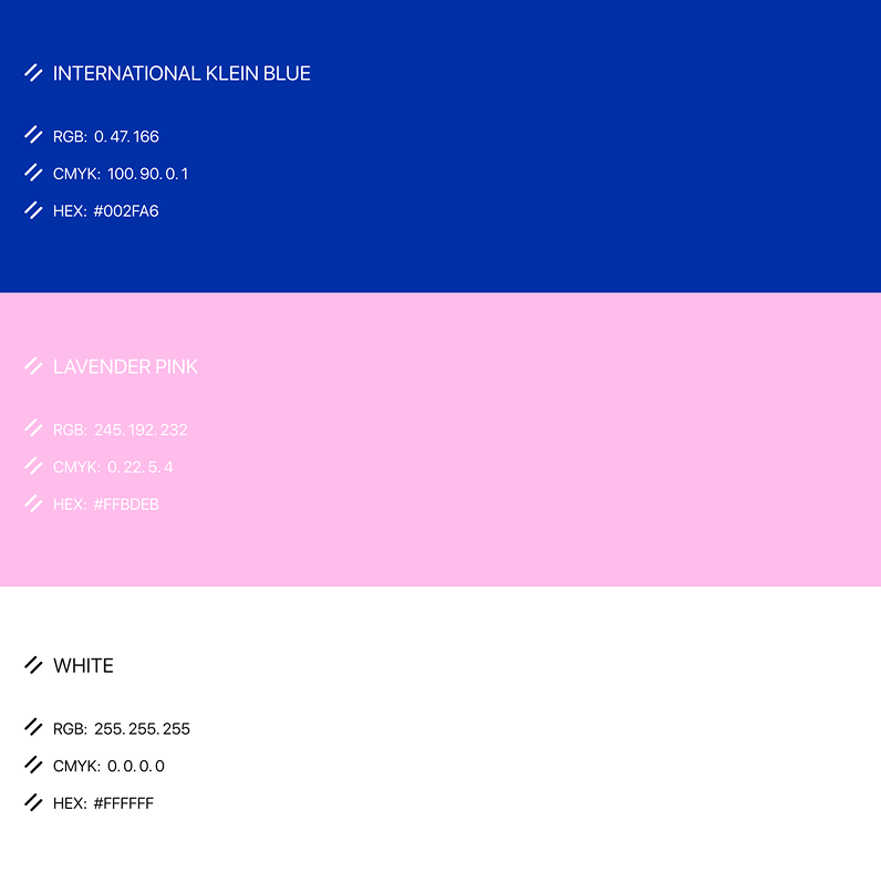
Brand Guidelines
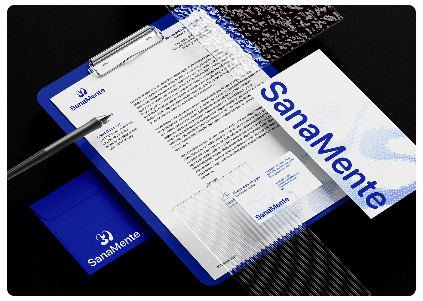
Establishes a clear set of standards that keeps every brand touchpoint consistent, recognizable, and aligned across every channel.

IMPACT & OUTCOME
Expresses the balance
between mental strength and physical vitality.
More professional
yet human visual tone feels credible without ever turning clinical.
Stays simple
and modern, easy to recognize across platforms.
flexible system
stays sharp across every touchpoint, from full lockup to favicon.





Let us
GROW
.webp)
your

business!