Case Studies
What We Learned Designing AI for 1.4M+ Students Across 170+ Countries?
Updated on:
17 September 2026
When people talk about AI products, the conversation usually begins with the technology. How powerful is the model? How many tasks can it perform? How quickly can it generate an answer? How many formats can it support? Those are important questions. Our work redesigning Raena AI raised another: how easily can a student turn those capabilities into a useful study session? Raena now reports 1.4 million-plus students across more than 170 countries. That is the platform’s current reach, not a claim that Capi created this audience or tested the redesign with all of those students.
A model can be powerful, fast, and technically impressive while the product built around it still feels confusing. The real challenge is not simply giving users access to AI. It is helping them reach a useful result without forcing them to understand all the complexity behind it. That was the challenge we faced while redesigning Raena AI.
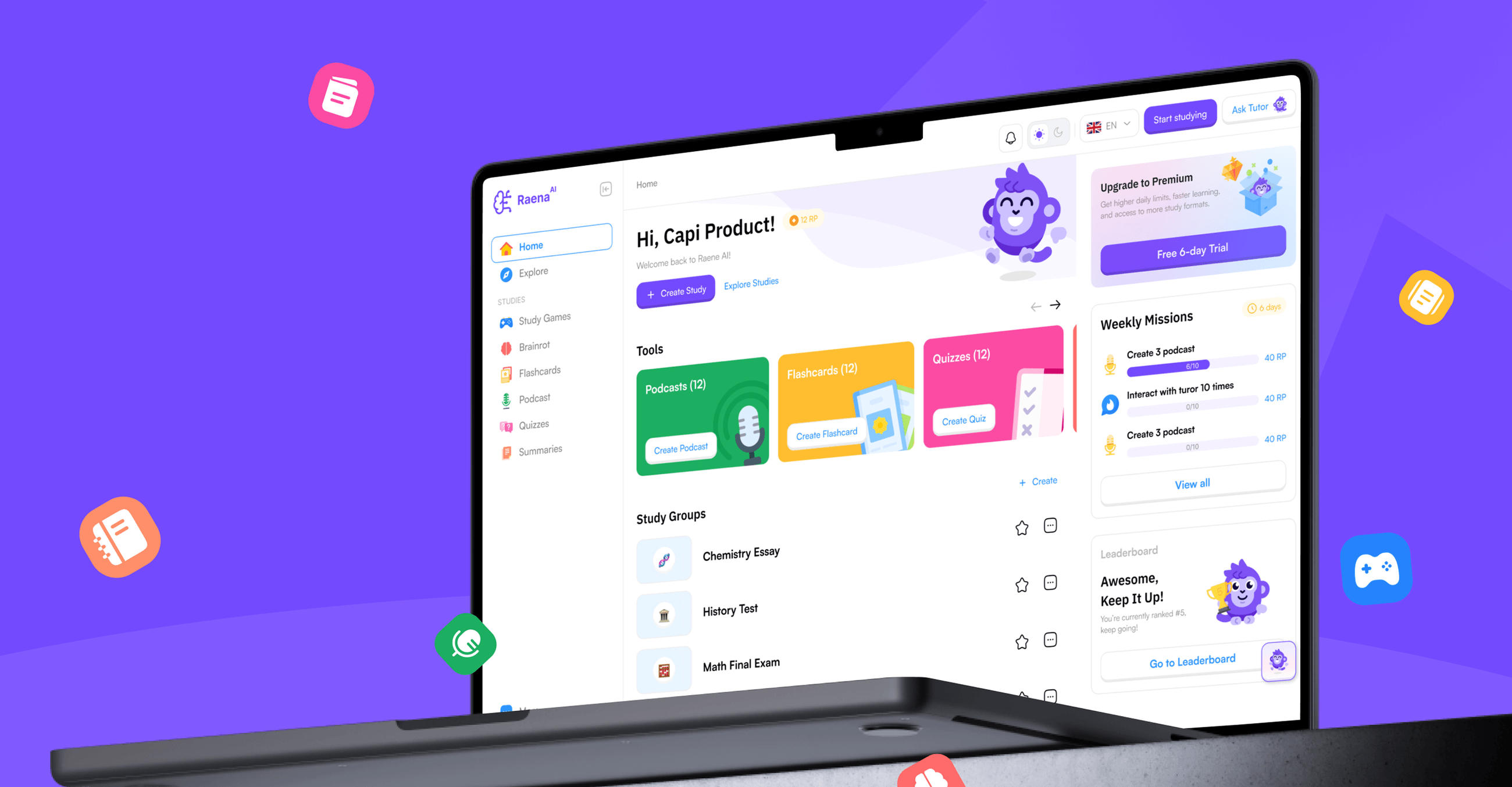
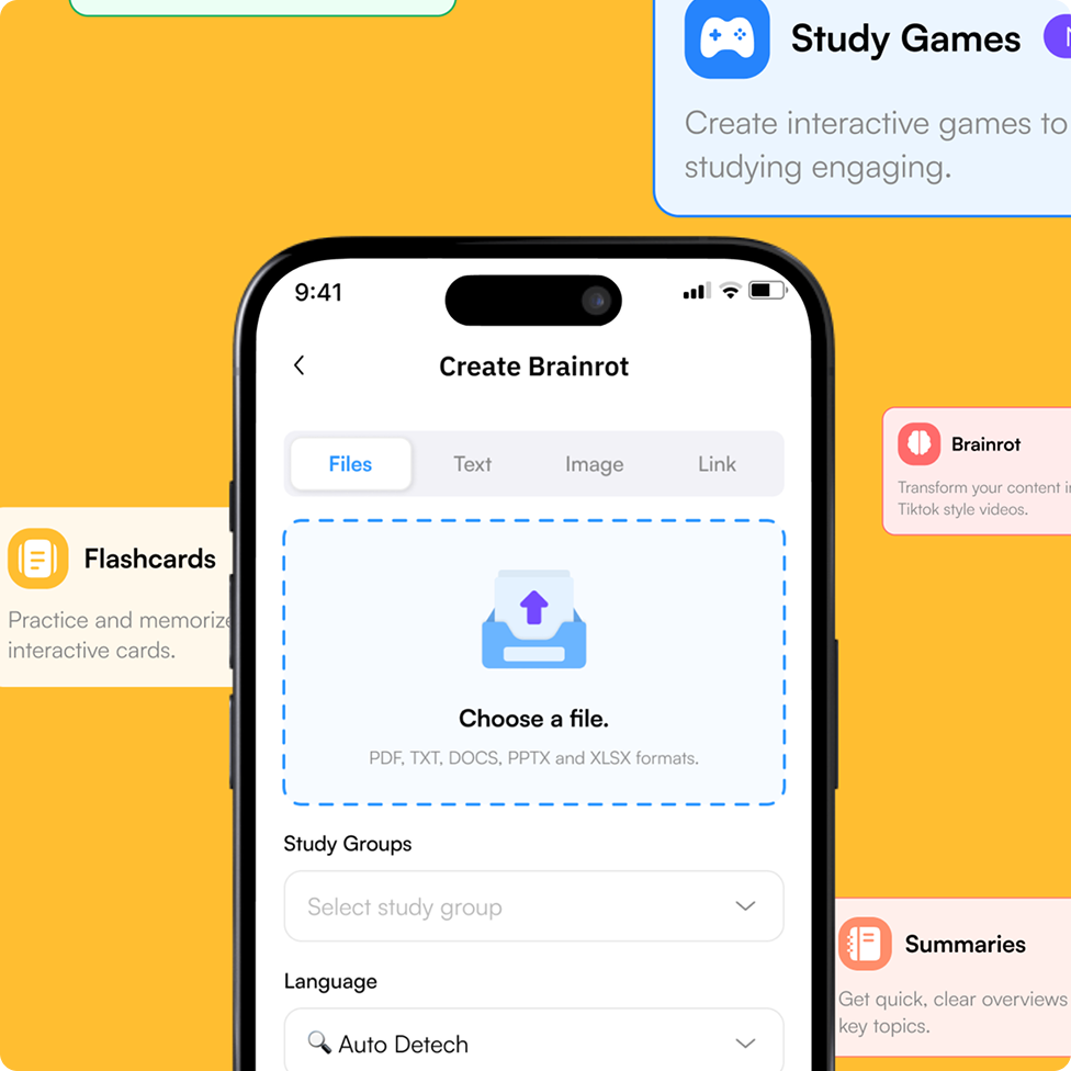
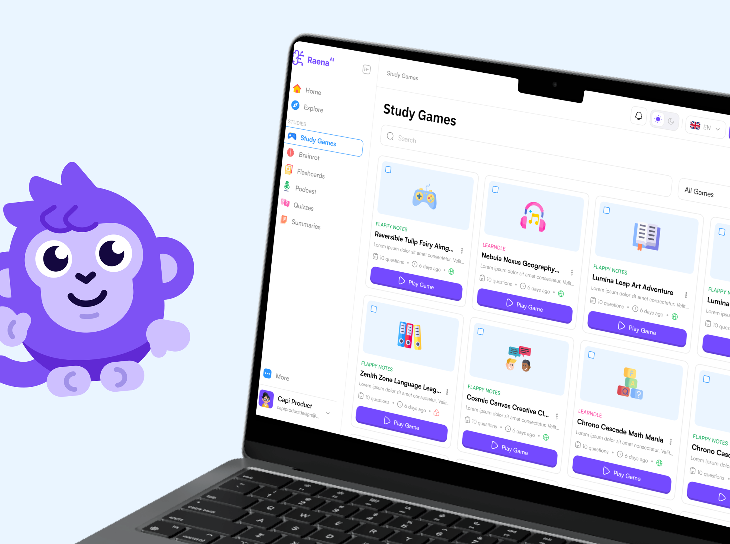
Raena helps students transform PDFs, videos, images, and notes into different learning materials, including quizzes, flashcards, summaries, podcasts, mind maps, games, brainrot videos, and an AI tutor. According to Raena’s website, the platform has generated more than two million study items and is available across web, iOS, and Android. Our published case study documents a dashboard redesign, a responsive design system, and refinements to the study modules. The examples below explain the design reasoning; hypothetical study scenarios are illustrations, not quotations from user interviews.
From a product perspective, this creates an interesting situation. Every new capability adds value. A quiz supports active recall. Flashcards help students retain information. A summary helps them understand the main ideas quickly. A podcast lets them study while doing something else. An AI tutor gives them a way to ask questions about their materials.
But every new capability also introduces another decision. Should the student create a quiz or a set of flashcards? Should they begin with a summary? Would a mind map be more useful? Where can they find the material they created yesterday? How do they continue the same study session on another device? As an AI product becomes more powerful, the interface can become more complicated.
This is one of the central design problems facing AI products today. The product team may see a growing list of capabilities. The user often sees a growing list of decisions. Our work with Raena was therefore not about making the AI appear more powerful. The case study describes an established product with multiple study formats and an international audience.
The objective was to make that power easier to understand, access, and use.
A successful AI output does not automatically create a successful product experience
It is tempting to evaluate an AI product by looking at the quality of its output. If the AI successfully produces a quiz, summary, image, presentation, or piece of code, the feature appears to be working. But from the user’s perspective, the experience begins much earlier. It begins when they arrive with an intention. A student may have an exam next week and a 60-page PDF they have not finished reading. Another student may have a recorded lecture and want to identify the most important ideas. Someone else may already understand the topic but need a faster way to practise before a test.
These users are not opening Raena because they want to explore an AI system. They are opening it because they want to study. That distinction changes the role of design. The interface should not begin by asking users to understand everything the product can generate. It should first help them move from their current situation to their desired outcome.
For Raena, that meant paying close attention to the journey between uploading learning material and beginning a meaningful study activity. We refer to this as time to first value: the amount of time and effort required before a user experiences the primary benefit of the product. In many traditional software products, users may tolerate a period of configuration before receiving value. In an AI product, expectations are different. The promise of AI is often speed and simplicity. If users encounter too many decisions, unclear instructions, or fragmented workflows before receiving an output, the product begins to contradict its own promise.
The technology may be fast, but the experience feels slow. This is why one of the main priorities of the redesign was to create a shorter and clearer upload-to-study journey. The dashboard was restructured around the actions students needed to take, rather than around the internal structure of the product. The study modules were refined so users could understand where to begin and how to move between different activities. The experience across web and mobile was brought into a more consistent system.
Capi’s published case study reports a 45% reduction in time-to-first-study. That number matters because it measures something more meaningful than the number of screens redesigned. It measures how quickly the product begins helping the user.
More AI capabilities can create more cognitive load
A product with eight useful features is not automatically easier to use than a product with three. Sometimes the opposite is true. Each additional capability creates questions about where it should appear, how it should be explained, when the user should encounter it, and how it relates to everything else in the product. This is especially difficult in AI products because many capabilities can begin with the same input.
A student can upload one document and potentially turn it into a quiz, flashcards, a summary, a podcast, a mind map, or a conversation with an AI tutor. From a technical perspective, this flexibility is powerful. From a user-experience perspective, it can create decision paralysis. If all options are presented with equal importance, the interface transfers the responsibility of organising the product back to the user. The user must compare every option before they can begin.
This is where feature presentation and product guidance become different things. Feature presentation answers the question: “What can this product do?” Product guidance answers a more useful question: “What should I do next?” The second question is usually more important. For Raena, the 8+ study formats described in the case study needed to work as parts of one coherent learning environment. They could not continue feeling like separate tools placed next to one another.
A quiz, summary, podcast, and AI tutor may produce very different outputs, but they still belong to the same broader journey. The student begins with learning material, chooses an appropriate way to engage with it, studies, and returns to continue making progress. The experience needed to make that relationship visible. This does not mean hiding useful functionality. It means presenting functionality according to the user’s current context.
A student uploading material for the first time does not need to understand every advanced possibility immediately. They need enough information to make the next useful decision. Once they begin studying, the product can introduce additional ways to continue, practise, review, or explore. This principle is sometimes described as progressive disclosure, but the underlying idea is simple: do not make users process complexity before that complexity becomes useful.
Powerful products do not need to feel powerful at every moment. They need to feel appropriate to the task at hand.
The most important journey is not feature discovery — it is value discovery
Product teams naturally want users to discover everything they have built. A considerable amount of research, development, and operational effort may sit behind every feature. It is understandable that teams want those capabilities to be visible. But onboarding users by explaining every feature can quickly become counterproductive. A long product tour may teach users where buttons are located without helping them understand why the product belongs in their workflow.
This is particularly risky for AI products because the value can remain abstract until the user generates something relevant to their own situation. A generic demonstration of a quiz is less convincing than a quiz created from the student’s own lecture notes. A sample summary is less meaningful than a summary of the document they need to understand before tomorrow.
The strongest onboarding experience therefore does not simply explain the product. It helps users achieve a small but real outcome. For Raena, the goal was to help students understand the product by using it. The dashboard, upload flow, and study modules needed to work together so that the first experience felt like the beginning of a study session, not a tour of an AI platform.
The case study reports 90% onboarding completion during a beta session. This is evidence of completion in that beta context. It does not, by itself, establish comprehension, long-term retention, or improved learning outcomes. Those require separate measurements. Good onboarding builds the correct mental model. The user should understand what they can provide, what the system will do with it, what kind of result they will receive, and how they can use that result.
Once this mental model is established, users require less explanation when they encounter additional features. Without it, every new feature feels like a separate product they need to learn.
AI products need to make uncertainty manageable
Beyond the changes documented in the Raena case study, uncertainty is a broader design consideration for generative AI products. The recommendations in this section are principles for product teams, not claims that Raena experienced specific failures or that Capi implemented every safeguard described here. Traditional software is generally expected to behave predictably. When a user presses a button, they expect the same type of action to happen each time. AI products introduce a different relationship between action and result.
The same input can produce slightly different outputs. Some materials are easier for the AI to interpret than others. A generated answer may be useful, incomplete, or occasionally incorrect. Processing time can vary. Users may need to refine, regenerate, or choose another format. This uncertainty is not automatically a product failure. It is part of working with generative systems.
But it becomes a design failure when the interface does not help users understand what is happening. If a process takes time, the product should communicate progress. If the result can vary, the user needs a way to review it. If the AI cannot interpret part of an uploaded document, the system should explain the problem in language the user can act on.
Most importantly, the user should feel that they remain in control. This is particularly important in education. Students use generated learning materials to prepare for assignments, tests, and exams. A polished interface alone cannot create trust. Trust comes from understanding where the output came from, what the product is doing, and what the user can do if the result is not useful.
Design cannot remove every limitation of an AI model. It can prevent those limitations from becoming confusing experiences. This led us to a broader principle: AI product design should not attempt to make the AI appear infallible. It should make the relationship between the user, the source material, and the generated result understandable. Users do not need a technical explanation of the model. But they do need clarity about the system’s status, the actions available to them, and the consequences of those actions.
The interface becomes the layer that translates probabilistic technology into a manageable product experience.
Consistency matters more when the output keeps changing
Raena is available across web, iOS, and Android. Designing across those platforms does not simply mean making the same screen fit different sizes. Students may use each device in a different context. A laptop may be used to upload a large document and organise study materials. A phone may be used to review flashcards during a commute. Another device may be used to continue a session that began somewhere else.
The layout can change, but the product’s mental model should remain stable. The names of actions, the hierarchy of information, and the relationship between source materials and generated study formats should feel familiar across devices. If the same feature appears to work differently on every platform, users must repeatedly relearn the product. That problem becomes more serious as the number of AI capabilities grows.
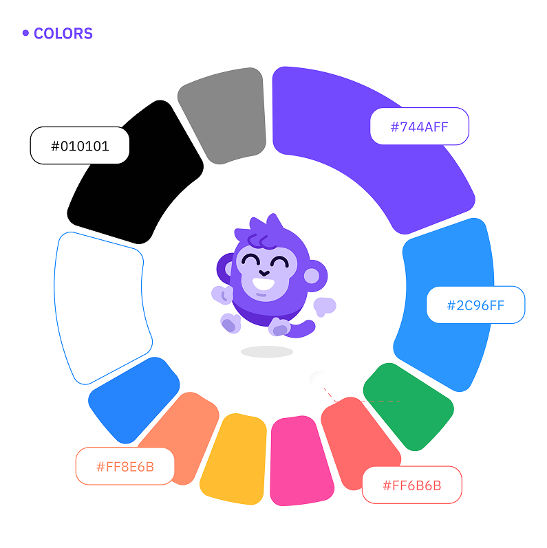
A design system was therefore not only a visual deliverable for Raena. It was a way of preserving the product’s logic as it expanded. The case study reports 8+ content formats brought into one design system. This created a shared foundation for navigation, interface patterns, responsive behaviour, and future product development. Visual consistency was part of the result, but it was not the final objective.
The deeper value was behavioural consistency. A student should not need to learn one interaction model for quizzes, another for flashcards, and another for summaries if those interactions serve similar purposes. Reusable patterns reduce the amount of new information the user must process. They also make it easier for the product team to introduce new capabilities without rebuilding the experience from the beginning.
A design system for an AI product is product infrastructure
AI products can expand quickly. Once the underlying technology is in place, teams can imagine many possible applications for it. A product that begins with summaries may add quizzes, tutoring, audio, video, or collaboration features. This creates pressure to ship new experiences quickly. Without a shared system, each feature may be designed and developed according to the immediate needs of that release. Over time, the product accumulates different layouts, labels, interaction patterns, loading states, and methods for handling errors.
The product becomes harder to use and harder to maintain at the same time. A design system helps prevent that fragmentation, but only if it extends beyond colours, typography, and reusable buttons. For an AI product, the system must also consider recurring behavioural states. What does the user see while content is being generated? How does the product communicate that an input is unsupported? Where do users find previous outputs? How can they try again? What happens when an output is incomplete? How is progress communicated across different formats?
These questions appear repeatedly throughout the product. Solving them independently in every feature creates inconsistency. Solving them as shared product patterns creates a foundation for scale. This is why the design system for Raena needed to support both the existing study formats and the continued evolution of the platform. The objective was not to freeze the product into a fixed collection of screens.
It was to create enough consistency that the product could continue changing without becoming increasingly difficult to understand.
Product design should reduce the cost of decision-making
One of the most valuable ways to evaluate an interface is to examine how many decisions it requires from the user. Some decisions are necessary. Students need to choose what material to upload and how they want to study. Other decisions exist only because the product has not organised the experience clearly enough. Where should I click first? Are these two actions different? Has my file finished uploading? Where did the generated content go? Can I return to it later? Will the same action work on mobile?
Each unanswered question adds friction. Individually, these moments can seem small. At scale, they determine whether the product feels simple or exhausting. AI products are especially vulnerable to this problem because they often present a large amount of possibility. The team sees flexibility. The user may experience ambiguity. Good design reduces unnecessary decisions while preserving meaningful choice.
It gives the user enough control to shape the result without requiring them to configure the entire system. It makes the next action clear without making the overall product feel restrictive. This balance is difficult. Too little guidance makes the product confusing. Too much guidance makes it feel rigid. Too many options increase cognitive load. Too few options can hide the product’s real value.
The solution is rarely to add more explanation everywhere. More often, the solution is to improve hierarchy, timing, language, and context. Show the right information when it becomes relevant. Use consistent actions for similar behaviours. Allow users to begin with a simple path and discover more advanced capabilities as their needs develop. The goal is not to eliminate choice.
It is to make choice feel manageable.
Measure the user’s progress, not the design team’s output
A redesign can produce many visible deliverables: new screens, components, prototypes, interaction specifications, and documentation. Those outputs are necessary, but they do not tell us whether the product became better. The more important question is what changed for the user. Capi’s case study reports three indicators for the project. The public page does not provide the test sample size, baseline timing, or measurement protocol, so these should be read as reported project results rather than independently verified causal estimates.
A 45% reduction in time-to-first-study was reported. 8+ study formats were unified within one design system. 90% onboarding completion was reported during a beta session. Each number reflects a different layer of the product. The reduction in time to first study reflects efficiency and faster access to value. The unified design system reflects consistency and scalability. The onboarding completion rate shows how many participants finished the beta flow; understanding and ongoing use need their own checks.
Together, these indicators tell a stronger story than a collection of redesigned screens. They show that product design can connect user experience with product performance. This matters when working on AI products because visual novelty can easily distract from the underlying journey. Animated interactions, conversational interfaces, and generated content may look impressive in a presentation.
But if users cannot understand where to begin, do not trust the result, or cannot return to continue their work, the novelty does not create lasting value. The purpose of design is not to decorate the intelligence of the system. It is to make that intelligence useful.
The collaboration behind the interface also matters
Complex product work rarely succeeds through a perfect initial brief. Products evolve. Constraints become clearer. New questions appear as designs are tested. Some ideas need to be reconsidered after the team sees them in context. That means the quality of the collaboration affects the quality of the product. A responsive design partner can help a product team move through uncertainty without losing consistency. Feedback needs to be understood in relation to the product objective, not simply applied as a collection of isolated requests.
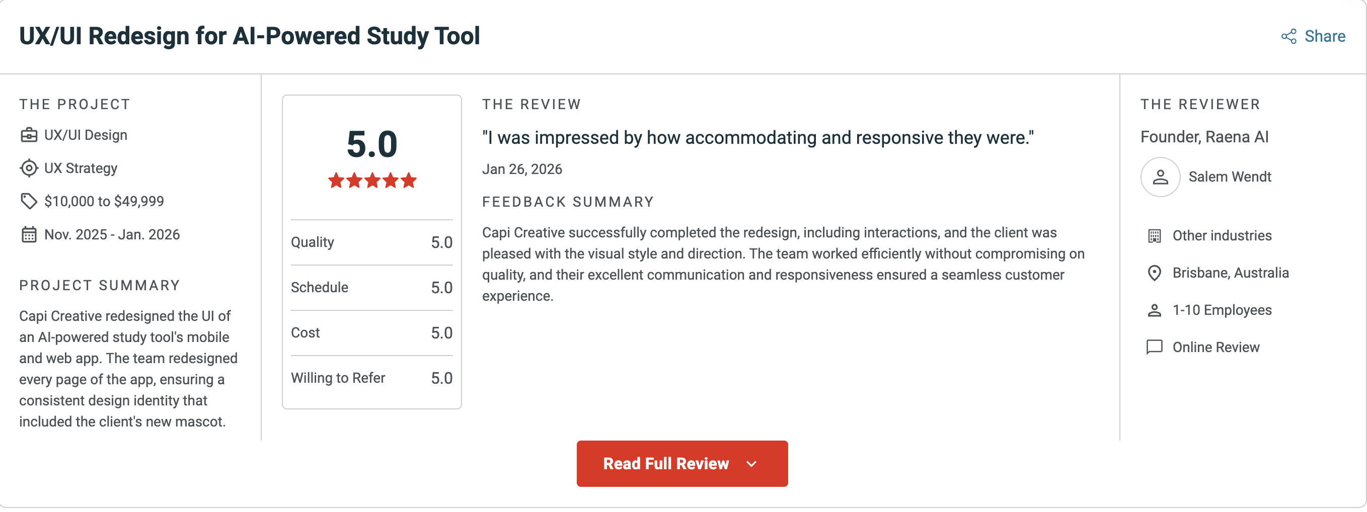
We were proud to see that aspect of the project reflected in Raena AI’s review of Capi on Clutch. In his January 26, 2026 Clutch review, Salem Wendt, Founder of Raena AI, rated the collaboration 5.0 across quality, schedule, cost, and willingness to refer. The review recognises the delivery and collaboration; it is separate from the product metrics above.
His comment captured the kind of partnership we aim to create: “I was impressed by how accommodating and responsive they were.” For us, this recognition matters because strong product design depends on more than the final interface. It depends on communication, shared context, fast feedback, and the ability to make decisions together.
The biggest lesson: hide complexity without hiding capability
Raena currently reports 1.4 million-plus students across more than 170 countries. It supports multiple input types, a range of study formats, and web, iOS, and Android access. The scale of the product is impressive. But the most important lesson from the redesign was not about scale. It was about simplicity. As AI becomes more powerful, products will be able to perform more tasks, generate more formats, and adapt to more use cases. The natural response will be to expose those capabilities as quickly as possible.
But a product does not become more valuable simply because more options are visible. In many cases, the opposite approach is needed. The product should absorb more complexity so the user experiences less of it. It should help users begin with their goal rather than the system’s capabilities. It should shorten the path between intention and value. It should introduce options when they become relevant. It should make uncertainty understandable and give users control over the result.
It should remain consistent as new features and platforms are added. And it should measure success through what users are able to achieve, not through how much technology the interface manages to display. This is where product design becomes essential to AI. AI can generate the output. Design creates the conditions that allow people to understand, trust, and use that output.
The more capable AI becomes, the more important those conditions will be. A great AI product does not constantly remind users how sophisticated the technology is. It helps them benefit from that sophistication without requiring them to experience all the complexity behind it. That is what we learned from designing for Raena AI.
Project reference and design examples: https://www.capiproduct.com/project/raena-ai
YOU MAY ALSO LIKE


Let us
GROW
.webp)
your

business!